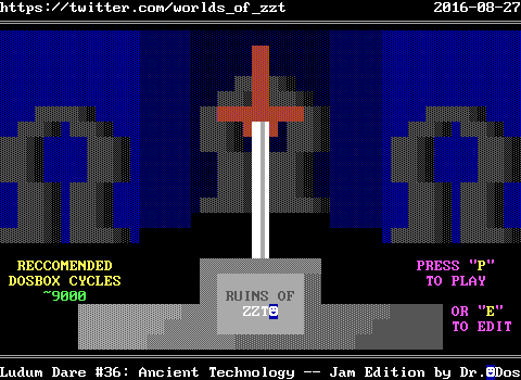
Ruins of ZZT
Released: Aug. 27, 2016
Barely a day before the Ludum Dare started, https://twitter.com/eevee" target="_blank">eevee had suggested that I make a ZZT game for it. In the past, I had considered using ZZT as a weird way to make entries for the Something Awful Game Dev Challenge (where you get a month to plan, a month to create) as well as the Ludum Dare itself! Ultimately I never did because I felt like making a game for MS-DOS in the second decade of the 21st century seemed like an excellent way to make sure nobody actually played what I'd make. This year though, with Worlds of ZZT being a thing, creating a game went from a silly idea to something actually pretty reasonable, and at the very least I could publish it to a small audience on Twitter who at the very least would appreciate that a ZZT game was made in 2016.
For those who aren't familiar with it, the Ludum Dare is a game development "competition" in which participants (either solo or in teams) are given a strict 48 hour time limit to create a game adhering to a topic chosen by a community poll. This is the Compo, the main event with judging and everything (well, except this time when they opted to try out not having judging?). Additionally there's the Jam, which is extended to 72 hours, no judging, and is much more relaxed. The topic was "Ancient Technology" and while ultimately most of that theme came from me making a game for a 25 year old Dos program, it wasn't my original intention for ZZT itself to be where the theme adherence came in. I would've had to drastically cut more content if I had opted for the Compo, so when that deadline was drawing near I decided to just relax and go with the extra day. Frankly I'd be amazed if more than one person played my game that didn't follow Worlds of ZZT anywhere, and in a world of game jams where 90% of people won't get around to playing your game if they can't play it in their browser, adding "Oh and you have DosBox right?" seems like another sad hurdle to overcome.
Though it had been several years, I at least had the benefit of having made ZZT games on a time limit thanks to the ZZT community's own history of 24 Hours of ZZT contests, which are exactly what they sound like. There were also longer Weekend of ZZT contests which match up with the Ludum Dare pretty much exactly. And of course, if there's one thing you can do with ZZT that you'll have a much harder time of with Unity, PICO8, Game Maker or any other environment designed to simplify and speed up game development, it's the Blitzkriegs. Contests which would be sporadically held on IRC with time limits as low as thirty minutes.
72 hours wouldn't be enough for a masterpiece, but I went in confident I could make something fun, and with some thought put into it vs just haphazardly placing enemies to shoot.

Ruins of ZZT was the result! I went in with zero ideas and wasted several hours just trying to figure out what I wanted to do. The only thing that came to mind, is that I always wanted to do a ZZT game that used a sword for the player's weapon instead of a gun. Plenty of games had RPG battles with swords or touching objects when they were char 1 and not char 2 to attack them instead of being hurt yourself, but I had always been partial to the sword engine from the ZZT Encyclopedia. I thought it would be a neat way to make fights against ZZT's built in enemies more of a challenge by forcing you to get in close when the usual strategy is to snipe from across the board.
The filename itself was even SWORD.ZZT as I didn't have a title yet.
"Ancient Technology" to me brings up RPG tropes of ancients who had powerful technology but were destroyed and the technology lost. Final Fantasy 5's http://vgmaps.com/Atlas/SuperNES/FinalFantasyV(J)-CleftOfDimension-Ruins.png" target="_blank">ruins tileset especially comes to mind with its mix of Roman pillars and unexplained pieces of technology like gears, spinning wheels, and moving chains. It also brings up images of Indiana Jones style temples, full of traps and mysterious artifacts that belong in museums. Lastly, it makes me think of Crystalis, since that game begins with you being awakened by a computer in a cave after being sealed away for who knows how long, and promptly receiving a sword which fit the one mechanic I did have in mind at least.
Additionally, I wanted to make a game that felt like one of the original ZZT worlds, primarily Town and Dungeons. I believe the first idea I came up with was exploring the ruins of the Town of ZZT, and essentially remixing the game (albeit from scratch) with a new path, and seeing how time ravaged the town. I started making Town's final board, with some of the walls crumbled away so you could get inside. The last board of Town has a white heart on it which triggers the #endgame command, so I had that there, and when touched some "faded" text would appear, which contained the default high score table for Town. Problem: I really had no idea what to do with this other than "oh the walls are broken and I guess some lions got loose". It also didn't really integrate well with a sword mechanic if I wanted to use that since Town was of course full of shooting a gun.
My next idea was a game about exploring some ancient ruins where just being in their presence prevented modern technology from working. I had a single intro cutscene started with this, where your guide said that he could take the jeep you were both traveling in no farther. The jungle went from a brown dirt road and dark green vegetation to an original ZZT colored yellow road with bright green vegetation as well. The plan would be for the player to continue, discover their gun didn't work, and have to acquire a sword before they could even begin to fight any enemies.
Then I got mad that I was so bad at drawing a jeep in ZZT. Also while the original ZZT worlds made good use of their limited color, having boards filled with blindingly bright green and yellow fakes was destined to look ugly and I wanted to have some reasonable presentation.
The third idea was the one I ended up going with, something that looked and played like an original ZZT game. I had already considered just calling it quits, but being on IRC and seeing eevee who opted to dive right in with a PICO8 game based on an existing engine they already made, and still only have "You can move left and right and jump but sometimes the left movement stops working?" meant that I was still ahead in progress by virtue of not having to program movement and collision detection for ZZT's player.
I decided to take a similar approach and just start making boards, worrying how everything would fit together later, and it didn't take long before things started coming together.
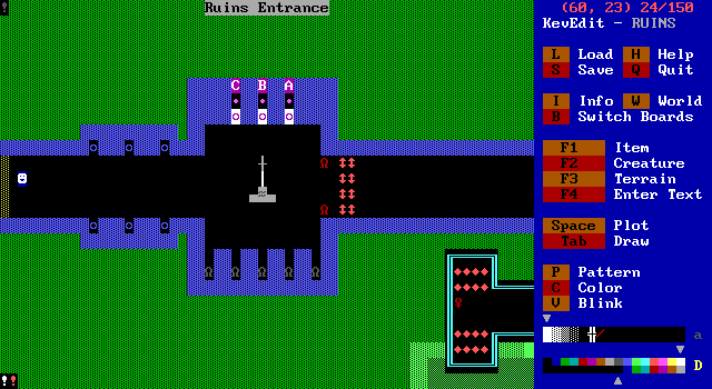
I started with the entrance (and a placeholder board for a menu to go later if needed), deciding that if I was going to do a game with a sword, I could have acquiring the sword be what locks the player into the ruins, and then similarly to Dungeons of ZZT, require some purple keys to be able to make it back out once more.
I didn't have a plot, but liked the idea of the ZZT Player themself being the same as the original, and frankly, the same white on blue smiley face in every single ZZT game ever made. ZZT is old, and most people haven't really touched it in at least a decade (and even that's being generous). I liked the idea of the ZZT Player themself feeling as if they hadn't been on an adventure in years, and wrote my opening exposition.
The opening is very overwrought, trying to explain to an audience playing the game what 25 years of ZZT has been in just a dozen or so sentences. The intro mentions that the ZZT Player has conquered dungeons, explored distant planets, dealt with political espionage, and worked fast food, and how those experiences influenced each adventure that came afterward. Dungeons is explicitly a reference to Dungeons of ZZT, the distant planets can be quite a large number of them, and the political espionage and fast food coming from two of the most well designed ZZT games I can think of, Evil Sorceror's Party and Burger Joint. Both games which I'm absolutely going to have to cover at some point. (One of the last threads posted on z2 is even "you will never play Burger Joint for the first time again")
Anyway! Once you pick up your sword, the lion statues spring to life and must be defeated before the gate to the main hub of the ruins opens. The ZZT Player mentions how the lions staggered pretty aimlessly, a reference to the fact that while you can adjust how well enemies in ZZT move towards the player vs. moving randomly, you can only do so when placing them in the editor. These statues #become lion and as such are locked into using the default stats for a lion, which is an intelligence stat that's dead centered. The plaque on the sword explains your goal of obtaining purple keys. It also mentions the game being themed like something from 1995, a deliberate change from 1991 as I was incorporating more use of objects and extended colored graphics! I had intended for there to be 5 keys but it didn't take long before I realized that would be way too many for my time limit, and dropped it to three. It was nearly dropped to two on the final day!
Both the gate and ZZT Player commentary were originally going to be more involved throughout the game. I liked the idea of using the experienced ZZT Player as a narrator who could point out the ZZT engines limitations. I believe there was originally going to be some dialog about the sword being bullets with limited range at some point. Gates would serve as a simple way to force encounters with enemies, but honestly a dozen boards of shooting lions didn't sound like much fun to me.
I also added the cyan area with the gems and key right away. Dungeons had a lot of twisting paths where you'd see things from one section of the board but be unable to access it until you find another entrance to the board. I wanted to incorporate this more as well, though the game turned out to be very linear in terms of getting from one board to another. I think this is the only board you actually do have to visit a second time to access everything on it.
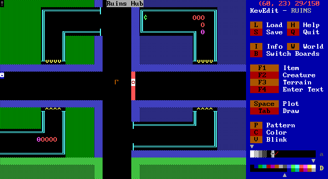
The hub came next. I wasn't sure exactly how I wanted to lay things out, especially since I had no idea what kind of boards I would have. I decided to lock away a corridor with a readily available key to introduce the key/door mechanic. I threw in some centipedes since they work well at having something moving on the screen that doesn't feel particularly dangerous, and works as a nice softball for the player to hit.
There's a green cent sign that gives a single gem and point and serves zero purpose. I was going to put more things like this throughout the game but never really thought to. Town has an "Ampersand" that gives bonus points, and Dungeons has a "Percent" that does nothing. (The Ampersand if I recall is actually named "Necklace" in the code. I suppose Tim decided to make things more abstract for the fun of it.)
I eventually added a sign to give the player some insight as to where they'd be headed. Looking at it now, you need a gem to actually do anything to the north, and a key to the east, so I'm guessing most people went south first which was the first room I made.
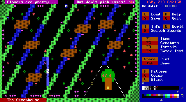
The classic ZZT worlds have a lot of named boards with text on the screen. The idea of a greenhouse with a gardener came to mind and so I ran with it. I had messed around with just drawing some random shapes in the editor and liked the appearance of diagonal running green walls. I added the water and bridges and realized that the club and spade character were often used in ZZT as trees, so if I used green ruffians I'd be able to fit the theme of the board.
Originally I was going to be hesitant to use special colors (in ZZT's default editor ruffians _have_ to be bright purple). I went with dark green over bright to add contrast to the walls. I don't think "enemy contrast" was something I had ever considered when making ZZT games in the past, but a lot of color choices in the game were designed with contrast in mind.
One issue I ran into was that if your sword bullet had to be erased, it would take out any water it was over or fake walls it was on top of. The fake walls ultimately didn't matter, but you can make a path through the water this way. I considered dropping the sword mechanic at this point, as it meant I couldn't really use water very well, or anything in ZZT that could shoot bullets. I was lazy and didn't want to have to worry about providing the player with enough ammo as well so I decided to just roll with it. It's not a ZZT game if the player doesn't have to abide by the honor system to not break things.
I don't know if people realized the roses could be shot and destroyed, and probably should have made the purple flowers destroyable themselves.
I added the gardener who needed to be bribed to be let in, similar to the bridge troll in Town. I thought about having him then trap you inside until you got some item for him again like Town's troll, but decided I didn't want to force the player to commit to a path if they weren't up to it.
Also I like my use of slashes to make a white picket fence for the Great Oak (tm).
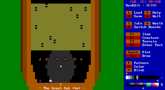
The lower half of the Great Oak (tm) was a lot of fun to make. I thought of the idea of blasting through sap with red "apple bombs" as a way to keep a theme going. Town of ZZT has a puzzle just like this, but much more brutal. Instead of grubs, objects begin shooting stars at the player, which are indestructible projectiles that always move towards the player. Stars eventually fizzle out, but the objects keep producing more, and they can also push bombs as they move towards the player, so it's very easy to make that screen unbeatable. It's also impossible to beat without triggered at least one of the star throwers!
I wanted to make sure that my screen was beatable without taking any damage. I also wanted to make sure that the player knew how big the explosions would be! Bombs hardly get used in ZZT as is, but anybody completely new to the game would have no idea how large the explosions are.
I think you'd have to do a very poor job to not make it through with six bombs, but just in case I added the blue beetle character (after looking up what the heck grubs turn into) as a way to restock the screen.
You can make them mad if you hit him with two bombs, in which case he erases the sap and all the maggots hatch. This also makes them unfriendly in the game's final battle, when I came up with the idea of having friends that can help you.
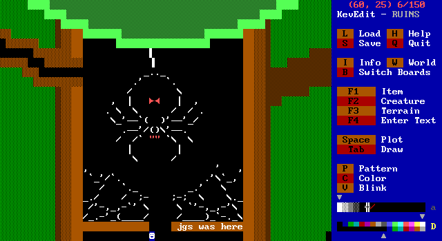
I thought about having a boss fight in the oak section, and a spider came to mind as something appropriate for that. I googled for ascii spider which is where I got those graphics from as well as the webs. I made up the gardener questline on the spot and had an idea originally for you to take her with you and plant her on his back.
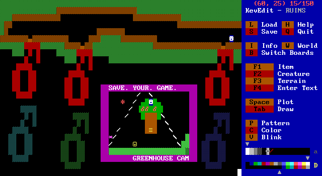
But then I had introduced "Apple bombs" into the game's lore. I like the complete lack of scale in the oak segment. The first apple bombs are as big as you are, but these ones are massive. The spider queen is huge compared to you now, but in the final boss fight she's no larger than you are. At the same time as tiny you drops giant apples, the greenhouse cam shows regular sized you dropping regular sized apples. It was fun to not worry about things having to make sense. I got a lot of vibes I had gotten before when making Mario Maker levels where I had a theme in mind, but the actual stage elements didn't matter towards that theme. (See: https://supermariomakerbookmark.nintendo.net/courses/3CF9-0000-00DA-AC8E" target="_blank">Welcome to Warp Zone)
Getting the large apple bombs to animate properly was a pain. At first I was going to make them out of objects. ZZT has issues with a bunch of objects that are connected to each other moving, but the effect looked even worse than I remembered. Then I was going to use invisible walls to reveal frames of animation, but realized I couldn't just make the apples on the tree red solid walls because they'd all be caught when I only wanted to make one invisible. Ultimately I had to use dark red on dark red boulders and sliders as a way to get three apples on screen and individually accessible in ZZT-OOP.
The Greenhouse Cam makes me think of Wayne's Worlds Get-a-load-of-this-guy Cam.
In retrospect, I should've made the apples "regrow", since this board violates my "no softlocks allowed" rule. There's at least plenty of warning to save, and the spider explicitly tells you you'll get a purple key so hopefully nobody thought it was optional!
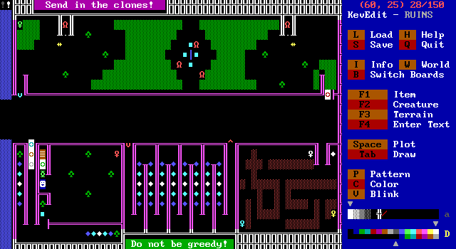
The next section I did was the eastern path. In Dungeons it was pointed out to me that there was a board with various items to collect in one section of the board, but the other section you'd access later had enemies coming from duplicators, which would get a head start if the player was collecting items early on. I liked the concept of the player needing to realize that they shouldn't collect items until _after_ completing the rest of the board. So I started to make a board where the player would have to move quickly and not want to waste any time.
That's why I put an invisible maze in! Normally, invisible walls in ZZT just show up with touched. A common adjustment to this is to make an object check for a revealed wall, and then make the whole maze flash instead. It's significantly less frustrating this way. Invisible mazes (or visible ones) still tend to be rather pointless, but I was hoping mine would be small enough and have purpose added to it with the duplicators slowly producing more lions.
At one point I put a spinning gun in the lower left segment, but then remembered that due to the sword engine, I wouldn't really be able to use them!
I had a hard time balancing this board since I didn't want there to be too many lions. I opted on the side of caution since I didn't want complaints that nobody could finish the game.
I also believe I made a mistake with my choice of key colors and not having a colorblind option for the game period. A later board offers one, but I didn't think of it for here. Even if you're not colorblind it can be very difficult to read the door colors. (At the very least I could've used special colored doors that better matched the key instead of ZZT's default mostly white ones)
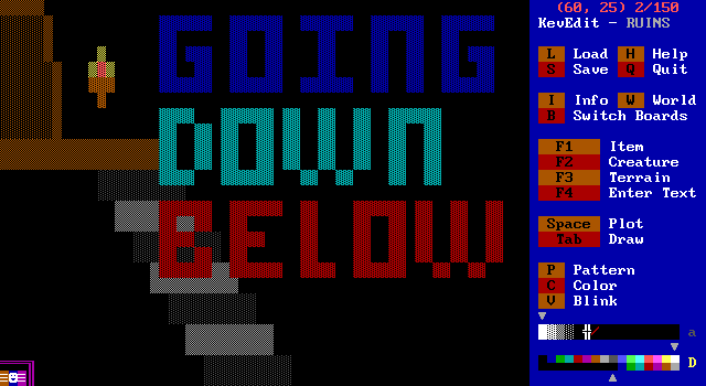
I just thought it would be fun to hype up this area of the game. It's sealed behind a locked door, and that room itself is also sealed away. Something to make it seem like the underground was a dangerous and scary place.
I also had absolutely zero ideas for what the underground would be when I made it. At one point I was going to have a picture of the player (by which I mean a large white on blue smiley face) "holding" a torch, descending the staircase. I couldn't really get it to look satisfactory so I just axed it.
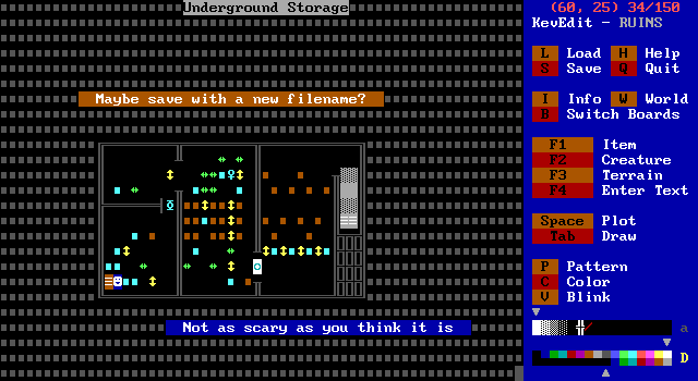
The underground storage area as it's called in the editor was a way to show off a more classical puzzle. While most of the game I tried to prevent the player from rendering it unwinnable (without cheating at least), there's no practical way to do this with a slider puzzle.
Slider puzzles, are a tremendous pain to make. You don't want them to be too difficult, but you also don't want them to be something the player can just breeze through without stopping to think about what actions they're taking. Ultimately, I'm dissatisfied with it. Every tweak I'd make to prevent an easy solution tended to break something else. The intended solution is to walk the player down the left column of crates, push the yellow sliders up to pin the key against the northern wall, then push the key out to the top left corner while making sure you had a clear path backwards to be able to pick up the key and also leave the room.
You can basically ignore 99% of that and grab the key right away and just push like 2 blocks.
The last chamber's puzzle is one I always remember from ZZT because a lot of games seemed to use it for some reason. I think it's used in A Link to the Past as well which is probably where everyone stole it from.
I made the filename warning to really hammer home that you don't want to trap yourself here. Then, when my lousy puzzle was done I added the message that it's not as scary as it looks. I should have used a non-cyan key here as well since it can blend in among the boulders.
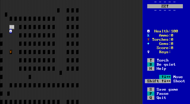
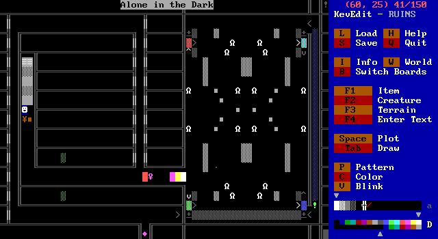
Alone In the Dark is hands down the most complex board in the game, and the one I had to spend the most time on! I came up with the idea of fighting white versions of enemies as "ghosts", and wanted to play up how in ZZT dark rooms are generally really bad.
So first let's talk about the left half of the room with the ghost. My original plan was to just have a dark corridor the player would travel through before reaching the action half of the screen and time things so the torch would run out on them and they'd have to press on blindly for a little bit before getting more torches.
The problem I ran into with this was that the player could stumble around in the darkness for a bit _before_ lighting their torch. I needed something that could stagger the player's progress and be able to ensure that they were in fact in the dark without any torches.
The invisible ghost blocks the player and won't appear until they're aligned and also checks that the player is out of torches. The box was placed to be certain that the player had to have picked up the torch in order to make it to the ghost in the first place.
Then he has his little speech, and asks if you trust him. Originally I considered having not trusting the ghost lead to a more difficult action sequence later on, but decided against having too much emphasis on an arbitrary choice of the player.
So the ghost appears to push a tiny light source around as the player now slowly makes their way to the second half of the room. Most things in darkness in ZZT just don't get rendered at all. Only passages, the player, and torches will show up. A (I believe unused) very late era concept in ZZT known as "the kangaroo effect" (obviously) involves putting statless passages around the outsides of your walls in dark rooms. This makes it so that in the dark you can still tell where you're heading by essentially giving a visible in the dark outline. (It got that name when somebody suggested it as a joke, and a young me said "That's canon now." Don't give 16 year olds power ever.)
So torches show up. I thought it would be really cool to have the ghost push a torch around and the player would follow it and I thought it would be a very unique effect. I programmed the whole sequence, tested it out, and whoops, torches for whatever reason aren't marked as something that can be pushed! They act like walls to objects. Talking on Twitter, the best guess for why this was the case was to make handling the rendering of dark rooms easier to code for since the player is the only thing that shows up in darkness that can move or be moved.
I really felt I had a good concept and tried to come up with an alternative. The obvious one, would be to have the object walk the path, constantly #putting a torch down and #putting an empty before each step. I didn't want to deal with making my code balloon like that. The ghost takes almost 100 steps in his path, and I couldn't just use ZZT's #walk command with it because being blocked by the torch would make it think the object hit a wall.
Players however, do show up. I could have the ghost place a player clone and shove the clone around, but then there's the issue with due to how movement is processed in ZZT, moving in a direction a player clone isn't blocked will cause the real player to teleport to that tile. Clones are "sticky" like that, plus player clones are always white on blue, which I guess could be considered following the ghost in darkness, but wasn't the effect I wanted.
However you can use players without stats! ZZT stores its boards first as a series of tiles, and then after the room data, it stores the "stats". Coordinates and information on tiles located at that position. Through external tools its possible to erase stats, which in most situations is pretty useless. A passage without stats for instance, means it doesn't have a destination board set and defaults to board 0, the title screen. A lion without stats will just sit there, never moving because ZZT doesn't know that there's something that it should move there. The player can still interact with it, walking on it to be hurt by it like a regular lion as ZZT runs its player updating code and sees they touched a lion, or that a bullet hit one to destroy it.
ZZT has a stat limit of 150 stats per board as a way to conserve memory, but since removing stats usually means removing the soul (if you're feeling philosophical) or the sprite.update() function call (if you're feeling programmatical), its not something that really has much purpose. There are only two real exceptions to this, and both typically used to serve the same purpose: statless players and stateless objects. These both have been used in various ZZT games to make "crowds" without hitting the object limit. If you wanted an arena or concert hall filled with objects in the audience, you'd hit the stat limit even though those objects don't need to do anything. By removing the stats, you basically get a wall. These are usually called "Dummies" or "Dumdums" or in the case of KevEdit, you can place a "Dead Smiley".
A statless player means you'll have something that shows up in the dark, and can also be black on black, matching the empty floors the player moves around on! So, the ghost is pushing dead bodies around as light sources. They can't go around corners, so at each corner a dumdum is shot by the ghost and removed, and the next one leads the way.
This sadly meant that each corner would have a visible space at all times, which would stick out like a sore thumb in darkness. There's no way to produce a dead smiley via ZZT-OOP meaning they had to be there in advance. So I also slapped down a bunch of them in unreachable areas to add a bit of visual noise to it. It also means the basement is full of dead players. Spooky!
After reaching the end of the main path and being left in darkness by the ghost, the player goes through a transporter they never knew was there and suddenly are warped to the far right side of the screen. An object detects their presence and closes away the transporter back. The player is now unable to move in complete darkness! This is about as survival horror as ZZT gets.
The ghost reveals it was all a bad joke, and gives you some torches. If you trusted the ghost he also gives you a flashlight which gives an additional 200 torches, so no need to worry about running out in the rest of the board, though the amount given in general should be more than enough.
The action area was originally going to have duplicators that didn't activate until you were in the right half of the screen, but they were giving me a lot of trouble and I cut them out. There's an object that plays music that's just silence on this board, muting everything, including the duplicators that no longer exist.
The graves were positioned in such a way to prevent false positives with the player or lions stepping on them, while also allowing the player to exit if they accidentally did travel into one.
For some very frustrating reason, the lower left grave refuses to work! Its code is identical to the others except for the direction to check for a boulder being different, but it just won't go. I have absolutely no idea why this happens, and it kind of ruins the board a bit. You won't get a message for pushing a boulder on it, and you also never get a "You did it!" message for covering up all the graves. I had to actually cheat the coding and as soon as you walk into the grave area, the game erases the wall the lower left grave is supposed to erase. So, in reality you only need to cover the other three graves.
This board took up a ton of time to make, and definitely has its ZZT quirks, but I'm really happy with how it turned out, and to my knowledge no other game used dead players as a light source!
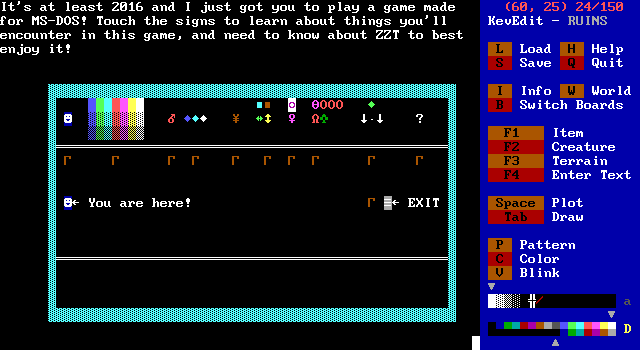
At this point I had enough done that I thought it might be wise to start making a manual for it, in case people who never played ZZT gave the game a shot. I didn't want them to be completely lost. Recently eevee played ZZT for the first time ever, started with Town and then moving to Ruins for their second game. They completely ignored the signs on the board as Town made them all clear enough, but maybe one day this board will help somebody.
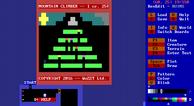
By this point, I was on the last day with maybe 7 hours left, plus needing some final testing and bugfixing. I tried to think of what to do for the third path that would be unique, and not take forever to make. I thought about using this path as a way to introduce people to a more complex engine than the sword one currently in use. Something where the player wouldn't really be the focus of gameplay, but instead just touching objects to manipulate whatever the real focus would be. I considered some sort of racing minigame where you'd have to steer a car object around a track for a few laps and beat a time to get the last purple key. I also considered a simple game where you'd control a ship and shoot at enemies along the lines of Space Invaders.
I wound up going with something more original (to me at least, I'm sure there's a game with these mechanics out there). The Blue Beetle Climb simply involves an object that walks back and forth up the mountain, checking for solid ground underneath themselves when there needs to be a bridge instead of a pit. One nice thing about how this worked is that "falling" into a pit didn't make the object actually move south into it, so it was easy to have the object walk west until they hit a wall, then walk south until they hit another wall and know the object was in the bottom left corner. This made it simple to reset the game and continue avoiding softlocks. I enjoyed making the flag planting animation when the mountain was conquered.
After picking the colors for the bridges, which were chosen to not blend in with the green of the mountain, I realized red, purple, and yellow might be difficult to tell apart for some people. Ever since I watched a colorblind friend play through Super Metroid and be unable to tell which doors needed Super Missiles and which needed Power Bombs I've tried to make things colorblind friendly! In this case, the how to play section of the game offers a colorblind mode which makes the bridges change into A/B/C characters and highlights which button will move which letter, removing color from the equation entirely. I regret that I did not do a good job of this with the keys in the eastern path. Whoops.
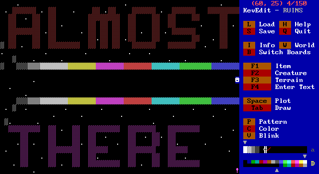
With all three keys, the player can leave the ruins and travel across this weird rainbow path leading into space? However, after passing a certain point the Gardener reappears! He is angry at what you did to him and forces you into the final boss fight. A passage appears and the player is sent to the final battle.
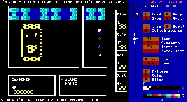
Well! This is certainly not what people who played the game saw! I really wanted to do an over the top RPG battle that ZZTers and MZXers alike were always putting in their games. The layout is based on Final Fantasy 1 here. The battle was essentially going to be rigged, making it so the player would always win. At the same time, how you treated the three characters would decide if they had magic or not. Magic in these sort of engines tends to be flashing invisibles that appear on the screen to simulate fire, ice, lighting, whatever.
I simply did not have the time left to finish this, especially with how long it had been since I made one of these things, and that I was being fancy with an object based system for selecting attacks rather than just popping up a text box with choices.
There are tools to convert mod music to ZZT's #play format (though quite a bit is lost in any conversion), and I was hoping to also find something like FF7's One Winged Angel, or Undertale's Megalovania to really hammer home how silly a grand RPG finale in ZZT really is. (I mean, maybe Undertale isn't all that https://www.youtube.com/watch?v=bE3m3uzvVXM" target="_blank">unlikely.)
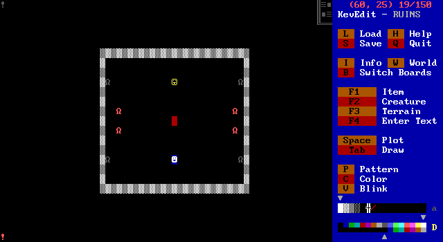
This board is in fact titled "The scaled down real final battle".
Here's the thing with ZZT's combat for boss fights like this: There's really not a whole lot you can do. Object movement is either going to be random, towards the player, or pre-determined. Since shooting the object will make it jump to the :shot label in its code, you'll have to restart its attack pattern with another label jump, so if you had an object move in a circle with /n/s/e/w to move north, south, east, and then west, shooting it in the middle of this cycle would make it start over at north.
One on one fights generally don't work out so well. Combined with a lack of time limit, and this is what I came up with on short notice. More lions. A boss that was invincible and you had to wait out. Friends who walk across the screen.
The blue beetle shows up first, and "slows those lions down", which doesn't actually slow the existing lions down. It actually makes the statues take longer to produce more lions. It's possible to upset the blue beetle and have them reject you if you bombed them a few times in the sap section of the oak.
The ghost shows up next, and if you trusted him, you get 200 health. Having seen two other people play through the game, it definitely dumps too much health on the player, but then that's one way to make sure they'll make it to the end I suppose.
Lastly is the spider queen. There's no way to upset her as you have to hit the gardener in the first place to win her favor. There's not even a flag set. She turns the block in the middle into a bomb so the fight can actually come to an end.
Bombs in ZZT, and everything else, disappear when they explode. But ZZT has them linger for a cycle when the explosion happens so it's possible to check for breakables to detect the explosion, and then change the bomb into a bomb, and the breakables into empties, creating an infinite use bomb! I was having issues getting everything to work properly, as for some reason this method causes objects to be sent to :bombed twice. I would up just doubling the labels, so looking at the code the Gardener should take five hits from bombs to defeat, but in reality it only takes three.
The final hit changes the explosion to fake walls and freezes the gardener in place. It's meant to be a cinematic sort of freeze frame of him caught in the explosion. It turns out it's possible for the timings of all this to be slightly off and for the bomb to disappear and the Gardener to not die as I learned in eevee's playthrough!
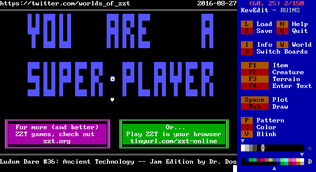
And that's the game! The "Game Over - Press Escape" message is overwritten by an object spamming a link to the Worlds of ZZT Twitter repeatedly, which makes it flicker and look strange to people not familiar with ZZT's lack of a custom game over message. You also receive a final 5000 bonus points if you've befriended everybody. I wanted the colors of the text to change, but ZZT also speeds up the game immensely in the game over state, so to do so, I put the object at cycle 50. For reference, the default cycle for objects is 3. Built in enemies move at cycle 2, and the Player moves at 1.
Making a ZZT game in 2016 was a ton of fun! I'm a bit disappointed I didn't really stick to the theme outside of making a ZZT game since I planned to make a ZZT game regardless of the theme. If I'm around for more Ludum Dares, I'd love to give it another shot.
Heck, I'd love to make more ZZT games in general. It's very relaxing compared to making games in a traditional programming language.
And How Does It Play Today?
Hopefully very well. I mean, it's barely a week old by the time this article goes live.
I may be biased though! But there's always DavidN's https://www.youtube.com/watch?v=IIm_fcfnj6s" target="_blank">Stumbling through Ruins of ZZT recorded playthrough if you'd like a second opinion!
Where can I get Ruins of ZZT?
Ruins of ZZT can be downloaded from its page on the http://ludumdare.com/compo/ludum-dare-36/?action=preview&uid=51438" target="_blank">Ludum Dare website. I will be looking into getting it added to Archive.org's collection in the future.
https://patreon.com/worldsofzzt" target="_blank">Support Worlds of ZZT on Patreon!
