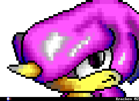
ZZT was released in 1991, and from the very beginning it was woefully outdated in terms of graphics. Contemporary PC games of 1991 included several 16 color games like id Software's Commander Keen: Goodbye Galaxy and Apogee's Crystal Caves. These games had a very restrictive palette to work with, but unlike ZZT, were running in proper graphics modes and not text.
Meanwhile, in the console world the Sega Genesis had been around and the US launch of the Super Nintendo meant that those playing games on mainstream consoles were getting the far more colorful graphics of Sonic the Hedgehog and Super Mario World. ZZT could never even hope to come close.
And yet despite its very restrictive colors and graphics, there was still quite a wide range of graphical capabilities from one ZZTer's work to the next. I'd like to go on a brief overview of the exact restrictions one has to deal with when working with ZZT as the medium, and show off some examples that really push the level of quality one would expect it to be able to produce
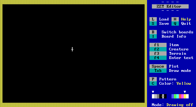
First let's look at the technical specifications. As a text mode game ZZT runs at a 640x350 resolution, much higher than that of graphical games at the time, but of course significantly more limited by not having complete pixel control. The game runs in a standard 80x25 text mode, but even then ZZT's sidebar is visible at all times, restricting the author to a 480x350 space comprised of 60x25 characters.
So that's rough, but it gets worse. Despite having the ability to display 16 colors, ZZT's editor only allows the use of seven colors. Namely the high intensity ones which you can see in the color selector in the lower right section of the editor screenshot above.
Further compounding things, not all elements in ZZT can have their colors changed in the editor. You can make things like walls and objects any of those seven colors without issue, but a lion is always red, and a tiger is always cyan.
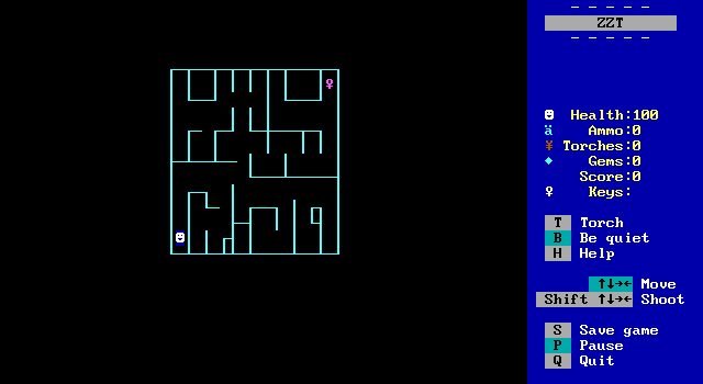
But we're not through yet. See this maze? It's made out of objects without any programming, so effectively a bunch of walls with custom characters. Here's the catch. This maze is made up of 150 objects, and objects have "stats", and thus to conserve memory ZZT has a limit of 151 stat elements permitted per board. The player is #151 here.
This board can't have any enemies added. It can't have a passage to take you to another room since that requires a stat. If the player tried to shoot, no bullet would spawn. A common criticism of modern AAA game development is that the focus is on graphics as opposed to how the game itself plays. In ZZT the tradeoff between graphics and gameplay can be very literal.
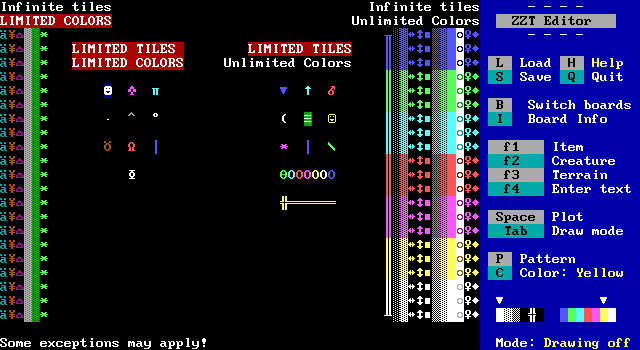
So let's take a look at which tiles can do what with the restrictions covered so far
On the left half are the elements which are the most restrictive graphically. Ammo, torches, energizers, water*, forest, and ricochets have their colors set in stone, but you can fill an entire screen with them if you wanted. The most restrictive elements are the player, ruffians, tigers, duplicators, sharks, bullets, bears, lions, stars, and scrolls, which count towards the 151 stat element limitation.
The right half is where your inner artist gets to play. The main types of walls, solid, normal, breakable, line, fake, and invisible can be used however you like. Along with boulders and sliders, gems, keys, and doors. Then there are the elements which have stats, but free color selection. These include pushers, spinning guns, transporters, passages, objects, slimes, conveyors, centipedes, and blink walls.
(*Despite only appearing in one color in the editor, ZZT-OOP can create water of different colors with commands like #put n cyan water. Also of note is that DEMO.ZZT which contains a brief introduction to all of ZZT's elements has water that's gray on dark blue, which isn't used in any of the original ZZT worlds. Most likely the switch was made as sharks in the water are much more obvious with the blue color.)
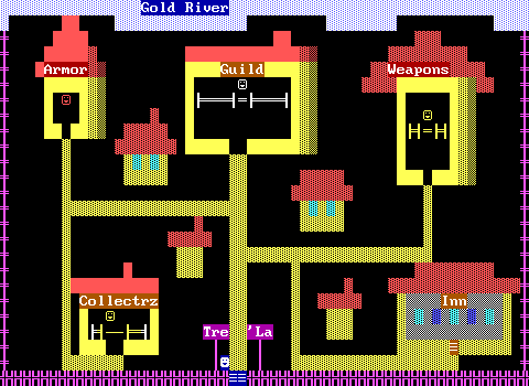
So early on, you'll find most ZZT worlds that aren't creating abstract geometry like Town, tend to come off looking very bright. This screenshot is of the main town in Adventure Part 1. The purple walls around the town are actually objects. Which means this screen uses 118 out of 151 stat elements. Even a board like this is cutting it close with ZZT's limits.
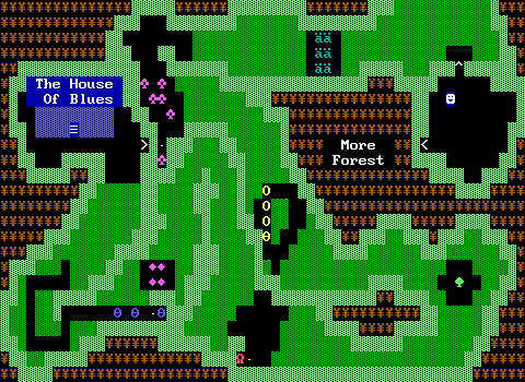
But even from day one ZZT's rules were being broken in the name of art. Consider this board from Town of ZZT, the first ZZT game. ZZT's default graphics probably handle a forest environment best of all with bright green walls and dark green, well, forests. The spade and club characters for objects are easy interpretations of a tree. Yet already, elements here are being used for something other than their intended purpose. The outer area of the board that the player is restricted from ever entering is filled with torches to give the forest some much needed brown coloring. It helps as well that the Yen symbol also makes a half decent tree trunk character as well.
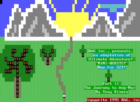
In fact, the use of torches for trees can be seen literally on the title screen for Adventure Part 2. A clever trick, but it's easy to take things one step further.
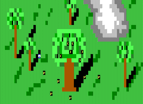
Brown! Honest to goodness brown trees! The Lost Monkeys by Chris Jong, released in 1993 already shows considerable improvements in just two years. Fake walls are used as grass, and that allows ZZT's regular empty tiles to be treated as shadows. There's a sense of depth and some rudimentary shading with brown and dark green walls.
And the secret?
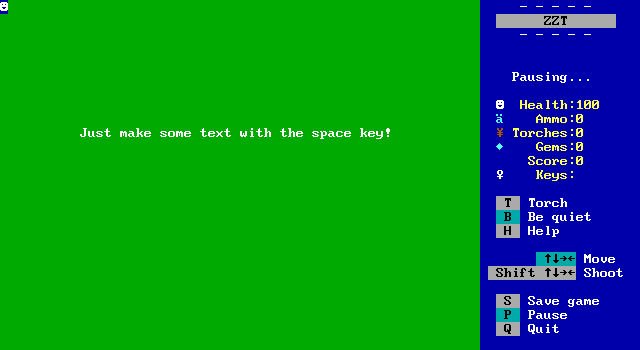
Simply using ZZT's built in text functionality! To the player, there's no difference between text and a wall. Using this trick you can produce effectively solid walls in dark blue, green, cyan, red, purple, and yellow. White text uses a black background, so unless you want an invisible wall that doesn't reveal itself, you won't get much use out of it.
Still, the darker colors offer the benefit of nice water, trees, ice, and really just add some more variety to the look of ZZT games in general. There is a downside to using this though. ZZT has zero ways to reference text in ZZT-OOP. You can #change yellow solid blue gem just fine, but text is text and always will be text.
The next innovation in ZZT graphics would come from discoveries again involving torches, and some other built in elements as well.
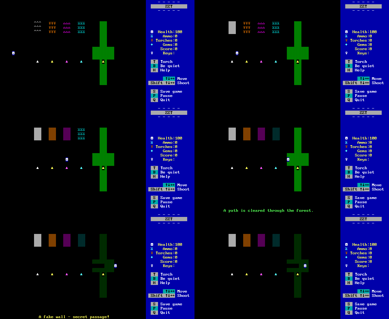
By using the #change command, and not specifying a color for the element to transform into, the current color is used. In the case of these elements, it means access to gray, dark yellow, dark purple, dark cyan, and black on dark green. This trick only really works via ZZT-OOP, so there's no real way to design a board with them in the editor normally. However, what can be done is playing the game, having the changes execute, and saving. If you then rename the file from .SAV to .ZZT, ZZT will realize you're trying to edit a saved game and reject it. Unless, you open the editor first, and use the ?+DEBUG cheat code. Then you can edit it like a regular ZZT world. From there, just export the board, load up the game that needs those colors, and import the board!
Now we're really getting somewhere. We've gone from 7 colors to 12. Of course, with foreground and background colors being independent, that's still a mere 12 out of 256 combinations, but the next discovery is arguably the most important discovery in ZZT...
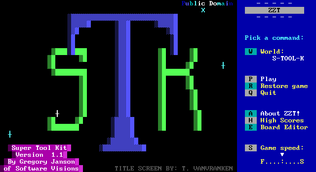
Alexis Janson's Super Tool Kit was the game changer in 1994. Alexis had been messing around with ZZT files, taking a look at its file format, where she noted that elements on a board were stored with three bytes, the quantity, the color, and the element. So ZZT's own board format explicitly stated, "One green on black object", "Four red on black solid walls", "Six dark yellow on black torches".
And so she changed those color values and saw what happened.
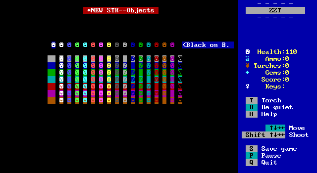
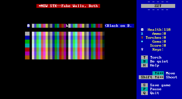
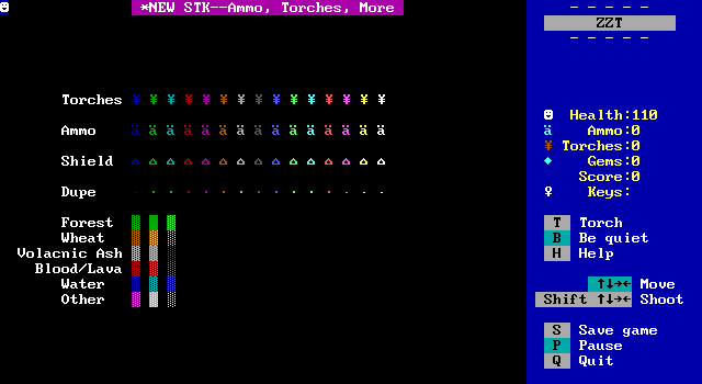
Suddenly, we had colors. We had every combination of them. Super Tool Kit had such an effect on ZZT's graphics, that using colors not possible in ZZT's editor became known as using "STK colors". Games released prior to Super Tool Kit would be referred to as Pre-STK. For ZZT, Super Tool Kit was an epoch, dividing its history into two halves.
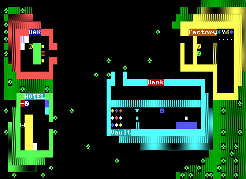
In 1991 a typical ZZT world looked like this:
By the end of 1994 you'd get something like this:
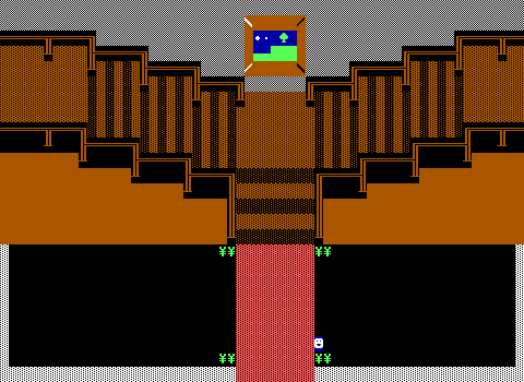
It was a huge leap! The only limit graphically was now the number of stat elements. No more issues with color when making your game. If you wanted a dark green ruffian it was yours. If you wanted to have the player walk on black on dark green fake walls as some light grass you could. If you wanted buildings in a city to be gray and not white, it was an option.

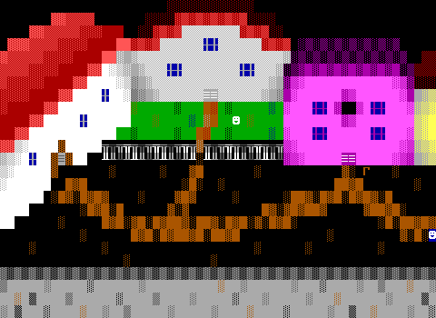
Here's that screenshot of a village in Adventure again compared to a screenshot of a village in 1998's Quest For Glory.
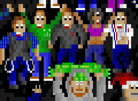
You could draw honest to god _people_ now.
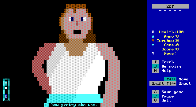
Of course, giving somebody more colors won't make them a talented artist, but for those better versed in creating artwork in ZZT, there was suddenly a huge change in what could be done. There was a cost though.
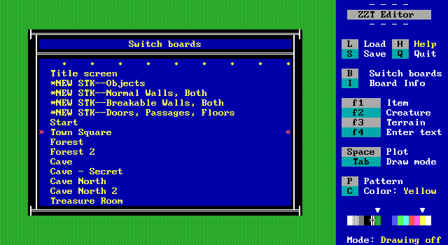
ZZT's editor wasn't built around these colors, so to get them in your own game you'd have to import boards from STK. ZZT does have a limit of 101 boards in a file, but few games would ever come close to this. The real cost was in time. Pressing enter on a tile in ZZT copies it to a single empty space on the pattern buffer. ZZTers would be working on their board, switch to an STK board, grab a specially colored element, switch back to the first board, and place the tile. For a complex board with a lot of uniquely colored elements, this greatly increased the amount of time it took to make a board.
There was also clutter in a game's board structure. A developer would import a few STK boards they'd need as soon as they started a new world, but then 10 boards in realize they also needed a dark green line wall and have to import another STK board and have it as board number eleven. There was no easy way to rearrange boards, so things could get disjointed.
The most popular way to combat this, was with the creation of a personal toolkit. Instead of STK's sparse boards with every variation of a single element on a board, toolkits (sometimes called color kits) would instead attempt to cram as much STK content on a single board based on what the author deemed most important to have quick access to.
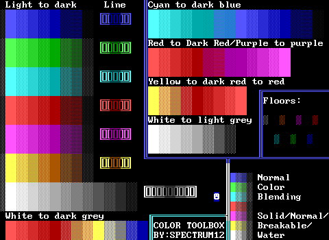
Pictured above is Spectrum12's Color Toolbox, to my knowledge this is the first toolkit. Compared to later toolkits it is extremely sparse!
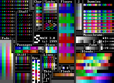
I personally was always fond of Super Neato All Color Kit (SNACK). Plenty of useful things are available along with several pre-made blends which were great for people like me who could not make a decent looking texture themselves.
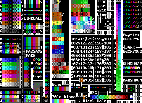
Ok, last one. This one was mine! It even has an ASCII chart shown in text and that scroll.
The world of color kits is ZZT at its most colorful. These boards are often such chaotic messes, and some people would go so far as to make toolkits that were two or three boards in size, which I always found overkill.
The age of the toolkit continued for quite a bit, as there weren't really any improvements to actually make, at least not within ZZT itself...
Ok, I'm exaggerating a bit when I say there aren't any improvements left. While Super Tool Kit provides vast numbers of specially colored elements, it doesn't cover everything.

You can see here a huge lack of special colors for these items. Others would go on to fill out the rest. Starting with Chronos's More STK. This filled out the rest of the essentials, with ammo, torches, keys, doors, and all 256 possible characters of text as ZZT's text input didn't support using alt-codes. Chronos went on to release Weird STK as well, which plays around with what happens when you remove the stats from elements that normally have them. This gives you things like enemies which can't move and player clones that come in any color and can be used to make a crowd without having to use an object. Lastly was WiL's WiL STK, which introduces the previously unknown monitor element that replaces the player on the title screen and reacts to keys like world selection and viewing high scores. It also has bombs that take more or less time to explode, and well, weird stuff that doesn't have much of a point, like statless slimes that cause ZZT to crash when touched.
But with all these STKs, ZZT has hit its natural peak for graphics capabilities. To do anything else, ZZTers would have to look at modifying things that ZZT has no control over.
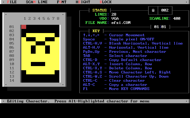
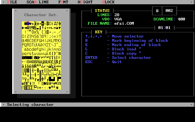
Font Mania is an MS-DOS utility which allows creating temporary replacements for the system font. The program was released in 1992, though it would be some time before the ZZT community discovered it and began to create custom fonts. Now your tough action hero didn't have to have a big smile on their face at all times. The screenshots from Font Mania are using the font created for Raichu's game Escape From Zyla Island. You can see various weapons, a flashlight instead of a torch, and some angrier looking smiley faces, including ones facing different directions.
Font Mania could be used to create an executable that could set and clear a custom font. By making a batch file to load the font, launch ZZT, and remove the font when done it was possible to easily use these fonts in ZZT.
One malicious individual in the past submitted a game that used a font, but the batch file was a "virus" (their words) which deleted all the files in C:\ZZT! What a jerk.
Ultimately though, fonts saw limited use in the ZZT community. z2 lists about 40 files with fonts, and several of those are just "you can use this font in your game!" type releases, and not worlds that actually use them such as Hyper ZZT, shown here:
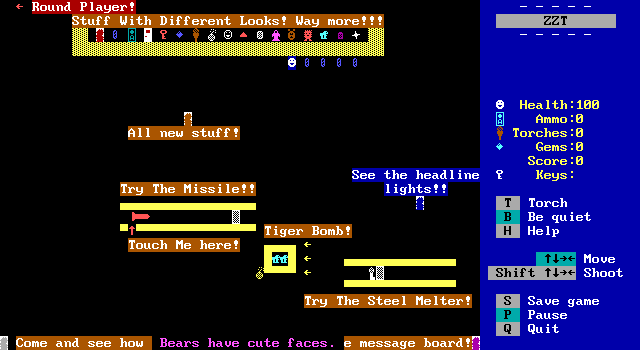
I'd wager the biggest reason for fonts not taking off in ZZT was simply that they didn't add all that much over the default tileset. An omega might not be the best representation of a lion possible, but frankly, with an 8x14 working resolution, you'll never really be able to get all that much better. Plus, you're still stuck with only one possible character for builtins. If you use the Hyper ZZT font, every passage is going to look like a cave entrance. That's fine for a cave, but falls apart when you're making an entrance to a building or a staircase to the next floor.
If you're not using a custom font, then your passage is going to be a logical equivalence character for a cave, door, or staircase. The passage character becomes abstract enough that it doesn't take too much of a leap to see it as a door or stairs, and though it might be more lacking as a cave, the limitations of ZZT are expected. Creating a font often means "fixing" the appearance of some tiles, but that comes at the expense of removing their versatility as abstract forms.
Only two worlds with fonts are particularly noteworthy. WiL's 2000 release Banana Quest, and the 2004 art compilation Ownage Triangle by aetsch and Kracken (lovingly compiled by Zenith Nadir). Here's the font used in Banana Quest:
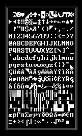
As you can see, it touches very little. There are bananas of course, and a few other oddities like a horn and what I believe is supposed to be a flank of meat. Other than that are a few triangle shapes scattered throughout the font. However the replaced characters are chosen very purposely. The diamond, asterisk, house, and lowercase A with an umlaut are used in ZZT for gems, richochets, energizers, and ammo. So why replace built in elements like this? For the art. All of those elements can be produced in any color and any quantity. By replacing these elements, it's possible to use these tiles without running into the stat limit on a board.
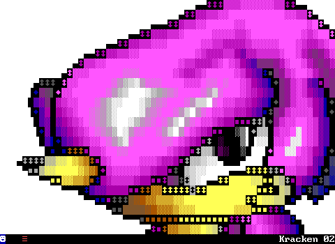
Meanwhile, Ownage Triangle's font is even sparser. It only changes the characters used by sliders to match some of the half-block characters for the same reason as Banana Quest. In this case the font exists solely to bend the rules of a stat limit, and looks functionally identical to a standard ZZT world.
Check out this super cool drawing of Sega's Espio the Chameleon character shown without and with the font in use:

With STK and fonts, ZZT had hit its peak graphically. Yet there was still more to do. By this point in time, ZZT wasn't the friendliest program to make ZZT worlds with. Constantly switching boards to get STK colors, objects whose code would sometimes randomly delete itself. Boards that used too much memory would sometimes get corrupted when saving. It was frankly a bit of a mess for what people in the late 90s and early 2000s were trying to do with ZZT. Fortunately, a modernization was about to occur.
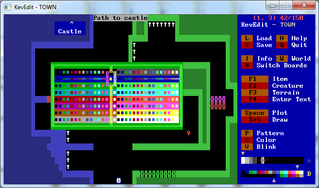
In 2000 Kevin Vance released KevEdit, the first external editor for ZZT. The most important feature, was innate support for STK colors. No more toolkits, no more running back and forth between boards. But KevEdit offered a lot more over ZZT's own editor than just a nice color selector.
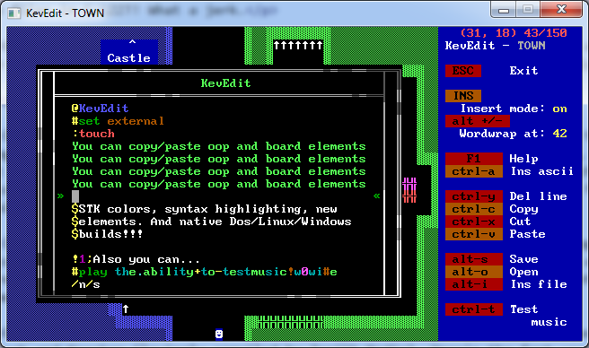
Its object editor also offered lots of convenience. Syntax highlighting, word wrap, the ability to copy and paste text (and also chunks of boards in the editor's main interface), exporting and importing code to text files, all of these helped greatly speed up the process of creating a ZZT world.
And while a nice perk at the time, KevEdit being built for Windows and Linux systems let it keep going long after new PCs stopped being capable of running ZZT without Dosbox. Going into ZZT's default editor and actually trying to make things with it today feels very sluggish and clunky. If you're making a ZZT game today, you're almost certainly going to want to make it with KevEdit.
Around the time of its release, the use of external editors was actually banned for a few 24 Hours of ZZT contests in order to prevent people from having an advantage over those who weren't using it! This wasn't something that could really be enforced and the rule quickly gave way. Most ZZTers adopted an external editor eventually, with Zenith Nadir's sticking to color kits being a noteworthy exception.
Although KevEdit was the first external editor, it wasn't the only one of its kind. 2001 saw the release of CyQ's ZZT AdvancEditor, which offered many of the features of KevEdit, with a few of its own.
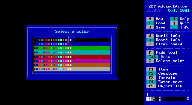
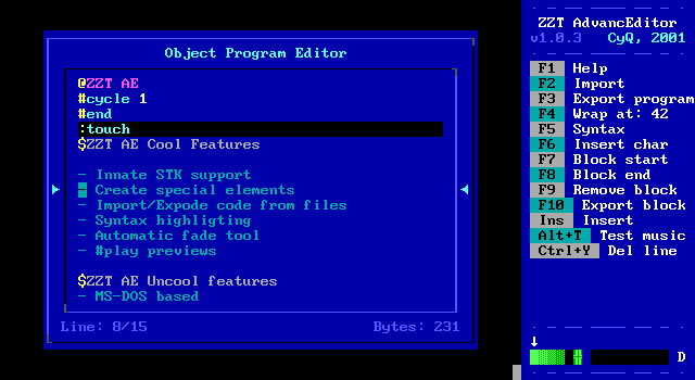
It of course had the same extend color selection that would become mandatory, as well as its own syntax highlighting and other features from KevEdit, but what made ZZTAE stand out was its built in fade tool for quickly creating graphics
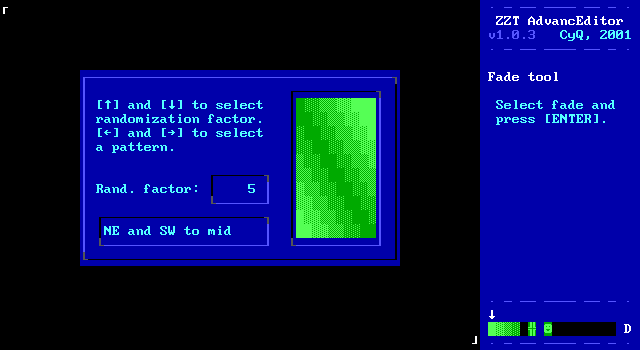
You could select a rectangular region of the board, and then select from 19 different patterns to apply over that region, with the ability to introduce random noise into them as well.
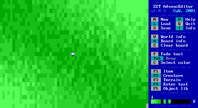
Not bad for just a few key presses. In KevEdit this sort of thing would still have to be done by hand, giving it a bit of an edge.
Although even with this very nice feature, KevEdit was generally considered the superior choice. ZZTAE was written in QBASIC and still constrained to MS-DOS, which today kills it, and back then meant sporadic crashes due to its own memory issues. To be fair to him, I was a ZZTAE user until I was no longer able to run MS-DOS programs natively and made the jump to KevEdit on Windows.
ZZTAE was also interesting in that it used some unused space in ZZT's file format to flag that the world had been edited with ZZTAE, which meant people using it in contests where it was forbidden could get caught cheating! It didn't take long before somebody made a program to erase that watermark, and again, external editors were shortly permitted in contests regardless.
Surprisingly, in 2008 when ZZT was essentially on its deathbed as far as games being made, a surprise third external editor came out, Saxxon Pike's ZAP
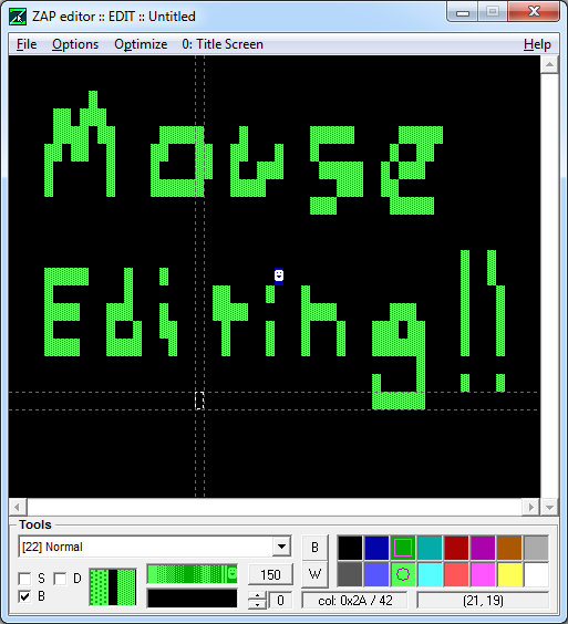
Compared to the previous two editors, ZAP wasn't as fleshed out, but that was because it was designed more to supplement other editors, and instead take advantage of its support for the mouse as a method of drawing boards. It was well received, but I don't know if anybody ever used it for a released world. Still, it stands out as something pretty unique compared to KevEdit and ZZTAE's approach of just replicating the default editor with a few more features to make things more user friendly.
One other claim to fame ZAP has, is that it doesn't just support ZZT worlds. The oft forgetton Super ZZT is also supported.
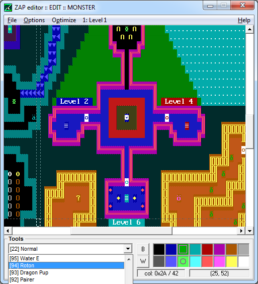
Super ZZT was Tim Sweeney's direct sequel to ZZT and needs an article on its own, but let's just say it never took off for a variety of reasons. Its editor is notoriously buggy, so if you were going to make a Super ZZT world, ZAP would definitely be the way to go!
And so that's about all there is to say about graphics in ZZT. It was an engine that was pushed beyond its limits repeatedly to squeeze out just a little bit more from an outdated medium of art. Super Tool Kit has often been credited as having added years to ZZT's lifespan, and while it's hard to say how true that is, there are certainly a lot of games where the default 7 color limit would have greatly impacted the game's atmosphere and ability to convey its story.
ZZT's rules are so bizarre and restrictive, but despite this people with or without STK created some rather stellar looking scenes. Its limits gave creativity to those who dared to push the boundaries, while also safely anchoring those who couldn't produce satisfactory pixel art in an environment where that didn't matter. In an industry where games graphics are still a selling point, there's something to be said about this program which taught people to throw that thinking away.
Addendum -- 2016-09-21
Wait a minute, wait a minute. I wrote all this and somehow missed one other bizarre tool created to get some interesting graphics into ZZT, Combuster's Z-Bitmap. Z-Bitmap is exactly what it sounds like it is, a tool which takes a user supplied bitmap file, and converts it into a ZZT board file.
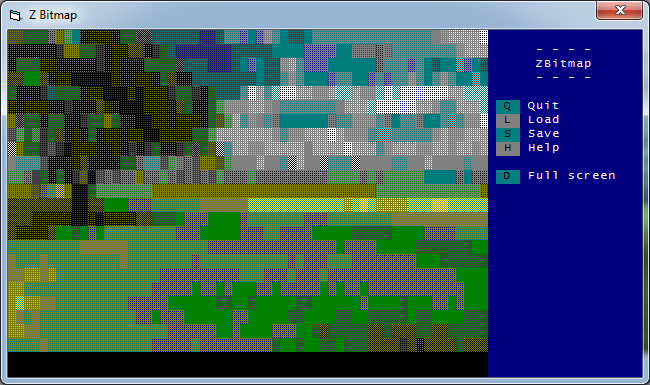
https://commons.wikimedia.org/wiki/Category:Scenery#/media/File:Adarshlovely.jpg" target="_blank">Original Image
It creates a very distinct look, unlike anything created by hand in ZZT really. The provided files don't really explain the process for converting images, but you can watch the conversion happen and it appears to simply average out each 8x14 section onto a tile. Due to ZZT's limitations with objects, it sticks solely to using solid, normal, breakable, and water elements to create the boards. For obvious reasons, it's difficult to get a solid looking conversion, but the output is generally understandable enough, if very blurry and lacking in detail.
In addition to just rendering the BMP, there is built in support for where to position the image on the output board, as well as scaling the image. It's tough to figure out what sort of images work best in ZBMP, generally things that are already low resolution and limited in colors to begin with. Ideally with a flat background, as the more detailed an area is, the more the background will be mixed with the foreground when converting.
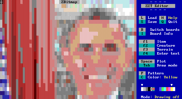
https://en.wikipedia.org/wiki/Barack_Obama#/media/File:President_Barack_Obama.jpg" target="_blank">Original Image
President Obama looking less than clear. A good example of how low res images need to be. I had cropped the original photo to turn the portrait into a bust and it still only fit only his head.
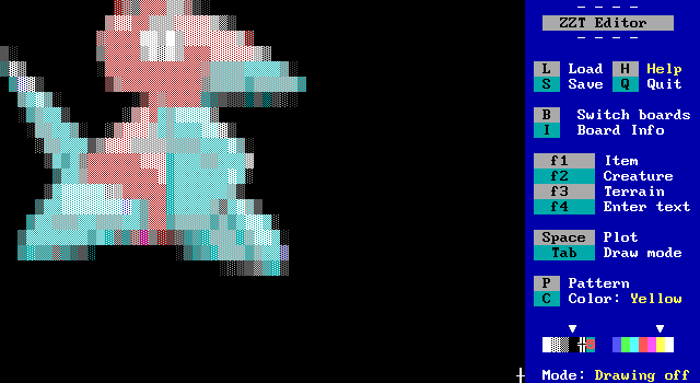
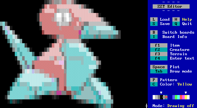
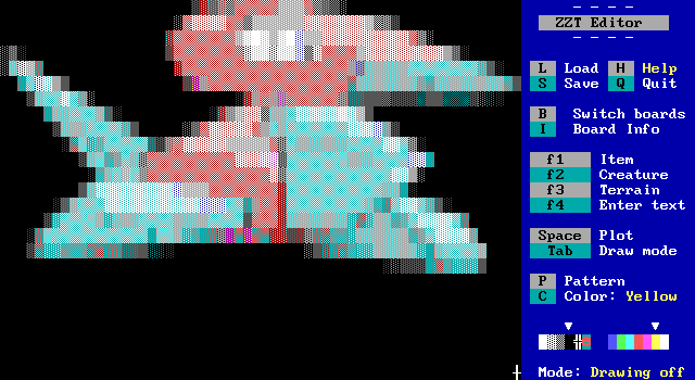
http://veekun.com/dex/pokemon/porygon/flavor#global-link" target="_blank">Original Image
Here's an example of the scaling, as well as an image which can better adapt to ZZT's blocky nature. I also gave the original image of Porygon a black background to fake transparency.
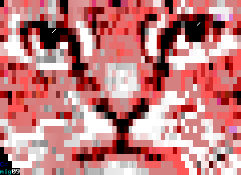
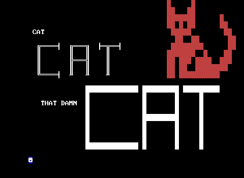
Z-Bitmap saw use here and there in ZZT worlds, probably most notably as the title screen for Commodore's CAT, CAT, THAT DAMN CAT release in 2009, one of ZZT's final releases. The game includes the original title screen before the decision to use a photo of Commodore's own cat instead.
Okay, now I think I've covered everything!
