Where can I get ZIG?
ZIG and its associated worlds are available on http://zzt.org/?p=database&search=zig21a.zip" target="_blank">z2, but there's no way to just browse ZIG worlds there!
ZIG isn't hosted on the Internet Archive's MS-DOS collection either. You're going to have to break out Dosbox on this one.
You can't even explore the worlds on the Museem site because wow do I have better things to be working on than support for ZIG files. But you can at least browse ZIG worlds specifically on the
https://z2.pokyfriends.com/search?category=ZIG&sort=title" target="_blank">Museum of ZZT Public Beta.
ZIG
R.I.P. 1997-2001
It's April, and for most people, April Fool's Day on the Internet is usually frustrating event full of good ideas for things that aren't actually happening but fans would love or sites that decide a great thing to do would be to become completely unusable for a day!
But for the Worlds of ZZT project, it's a perfect excuse to bend the rules a bit and take a lot at a lot of ZZT adjacent content! The month started off with a livestream of https://www.youtube.com/watch?v=I6VljA7WSSM" target="_blank"> Super ZZT's Monster Zoo, and it's going to keep going for pretty much the entire month.
ZZT was released in 1991, and as anybody will tell you, it was pretty outdated from the start. Super ZZT shuffled things around a bit, creating a more action focused environment with large scrolling boards, and a few enhancements like additional flags, a hint system, as well as a much larger array of colors available without additional tools.
The most powerful as well as the most (read: only) successful ZZT clone was Alexis Janson's MegaZeux, released in 1994. It kept the 16-color 255-character aesthetics, but brought with it a significantly more powerful language known as Robotic, customizable board sizes, support for mod music, mouse support, sprites, and a whole slew of things over the years. It's still being developed, one of the benefits of its source code having never been lost to time.
In the late 90s however, MegaZeux as an alternative to ZZT had a few issues to overcome. Firstly it was a very picky program, and a lot of people just could not manage to get it working with their PCs. Others would suffer from a lack of audio support or only be able to get the program to run with a forked version that removed the program's editor entirely to save memory. I was unable to get a fully working copy until the early 2000s, shortly before the first Windows port became available. So MegaZeux is mostly a blind spot to me.
Of course, even if you could run MegaZeux, it had its own share of issues with creating games. ZZT's limitations are a blessing and a curse. MegaZeux's considerable freedom in comparison makes it significantly more difficult to produce something of quality.
While all this was going on, ZZT in the late 90s and early 2000s was by contrast easy to make something in, but difficult to make what you actually wanted. When trying to produce your teenage masterpiece in ZZT, you'd be dealing with flag limits, board sizes, PC speaker audio, very restrictive numbers of objects, and so forth.
And lo', Jacob Hammond saw this plight and created this "ZZT-Inspired Game Creation System" that came to be called ZIG.
"ZIG is a GCS that fills the gap between ZZT and MegaZeux. It has the simplicity and ease-of-use of ZZT, but with the power of MegaZeux."
A noble premise, and one that would serve the ZZT community well. So let's take a look at each released ZIG world and figure out why ZIG just never took off.
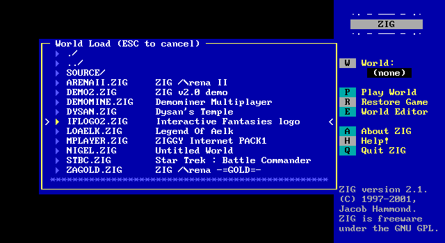
ZIG v2.0 demo
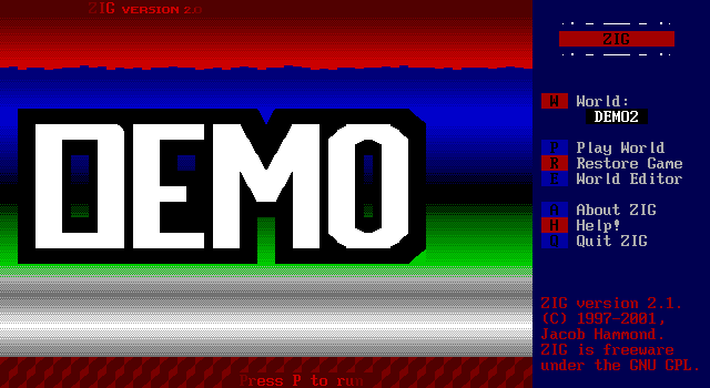
We'll start off with the program's included demo file, showing off several of the features ZIG has to offer to put ZZT to shame. Right away things already look more advanced than ZZT with these much smoother gradients consisting of non-default EGA colors. Some attempts at curves and slants show up in ZIG's default character set as well.
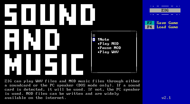
And it starts on the wrong board.
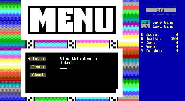
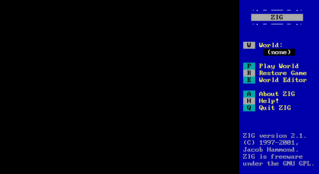
Jumping back to the main main menu we get this colorful screen and a not quite ZZT style sidebar. ZIG's sidebar is customizable and items can be added or removed via its scripting language, XOP. The documentation doesn't say what XOP stands for, but if my memory serves it's eXtended Object-oriented Programming.
There's also no instance of a "player" like ZZT. The player at the keyboard uses arrow keys and an object is coded to react to them being pressed to navigate the menu's selections.
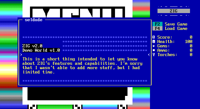
The about section brings up a scroll with no useful information. Super ZZT feels rushed and incomplete, but "close enough". ZIG is much the same way, but is explicitly so rather than just a feeling.
As I scroll the text up and down there are some ghosting issues seen with the asterisks continuing onto later lines. This will come up a lot.
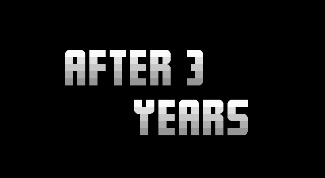
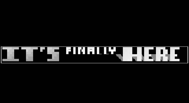
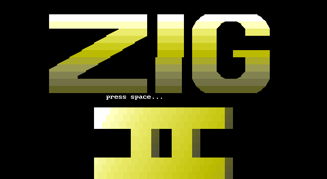
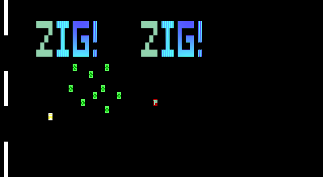
The introduction looks like something you would see in a MegaZeux game, large text fading in and out of the screen, as well as being moved up the screen into frame by shifting the camera offsets for the board. The sidebar is also gone in these boards as it can be turned off entirely. It's also an intro that takes place over multiple boards as objects can trigger a board switch instantly as in MegaZeux without relying on clunky machinery of duplicators, player clones, and passages that one would have to use for ZZT.
The "II" here refers to this being ZIG version 2.1a.
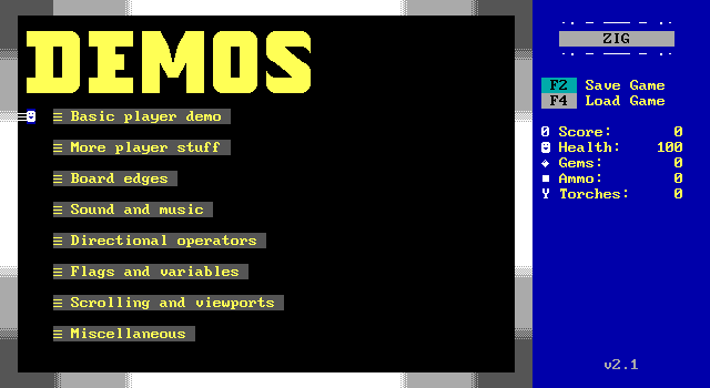
The demos section brings up an overview of some of ZIG's features that might be worth checking out. Here there's a standard ZZT player that can be moved into the passages.
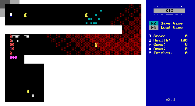
The player demo is essentially just showing off ZIG's ability to reproduce basic ZZT gameplay. There are some scrolls explaining how to move and shoot, which are identical to ZZT's controls, and the cyan boulders are in fact boxes of ammo which act like ZZT's ammo.
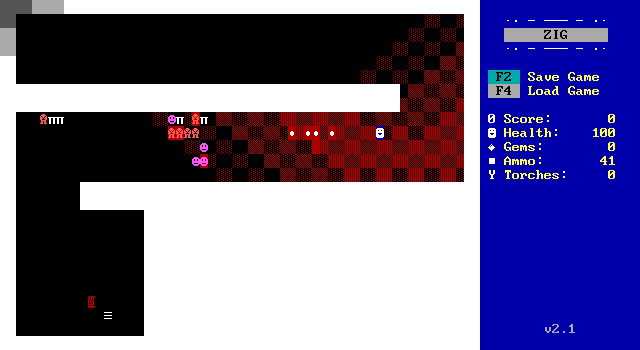
Upon rounding the corner the monsters charge towards the player. They're ZIG reconstructions of ZZT's lions, tigers, and ruffians, but they feel rather off. We'll get into detail as to why that is in the next demo.
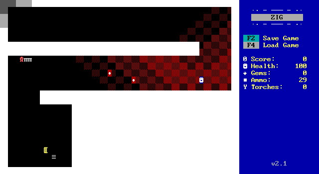
A few of the monsters lock up entirely and just don't move. That's all for this first demo.
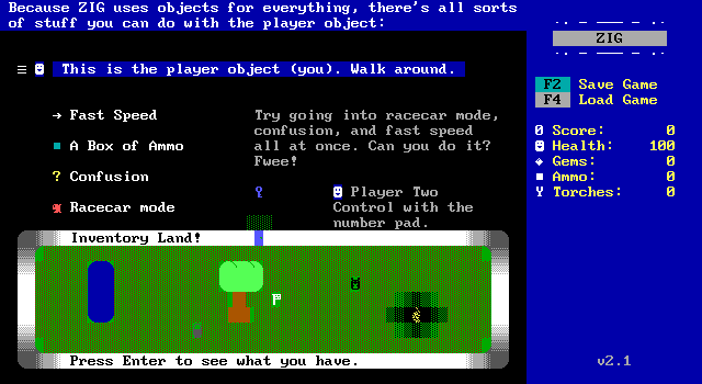
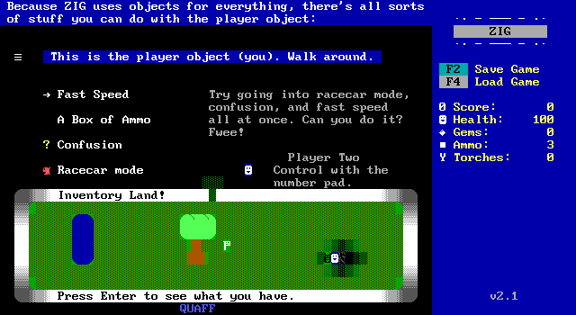
The second demo is the big reveal. ZIG doesn't quite have built-ins like ZZT, Super ZZT, and MegaZeux. Nearly everything in ZIG is an object running XOP, with few exceptions. Those enemies fought earlier? They were all hand-coded. Even the player is an object! It's completely possible to have up move the player south, or place another object, or anything else really.
The demo shows this off with a few objects that modify the player's properties. Fast speed of increases the player's movement speed, confusion causes them to move randomly without any input from the player, and racecar mode forces the player to always move forward with right and left steering them clockwise and counter-clockwise.
There's also a second player controlled using the numeric keypad and using the 0 key to shoot! We'll see a lot of attempts at crude multiplayer using this technique in other ZIG worlds.
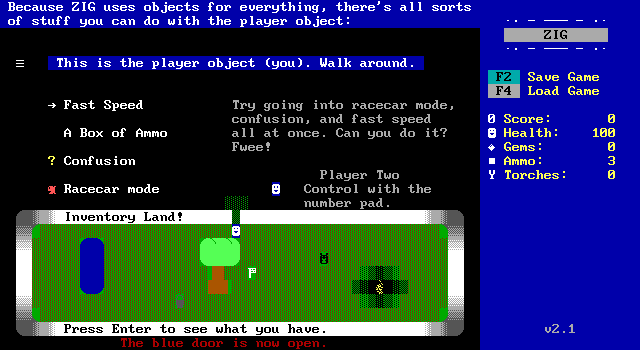
There's also "Inventory Land", demonstrating using keys to access a player's inventory. It's a much cleaner solution than ZZT's repurposing of its cheat system to set a flag and open an inventory.
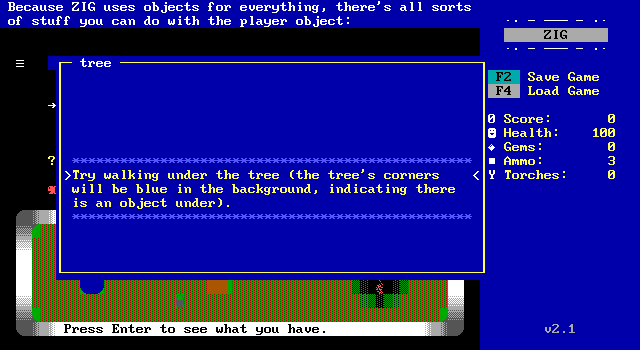
One of ZIG's biggest features (something even more complex than MegaZeux's equivalent) is just casually mentioned by this sign.
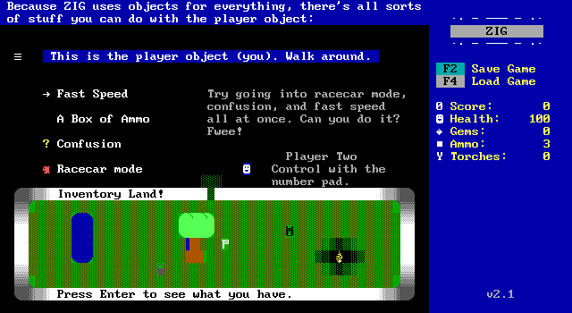
ZIG has a layering system! No longer are all parts of a tree walls for the player to avoid, now they can casually pass behind them, or in front of them.
ZZT has only one layer, and elements with stats can keep track of what they're on top of to prevent fake walls from disappearing when walked over, but ZIG's is completely customizable. Each board defaults to 3 layers, with the main layer being 2, leaving one foreground and one background, but the number of layers can be adjusted, which could be used for some awesome effects in theory.
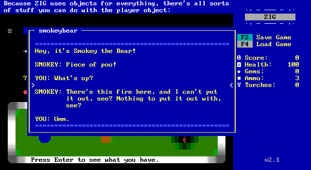
Smokey the Bear needs some help putting out a camp fire.
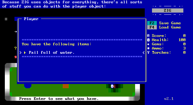
The whole process is straightforward enough, grab the bucket, use bucket on water, use filled bucket on camp fire.
Good job player. That's all for this demo.
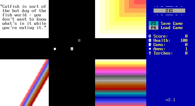
The next demo is board edges. Just as in ZZT and its clones, the player can walk off the edge of one screen and onto a connecting board.
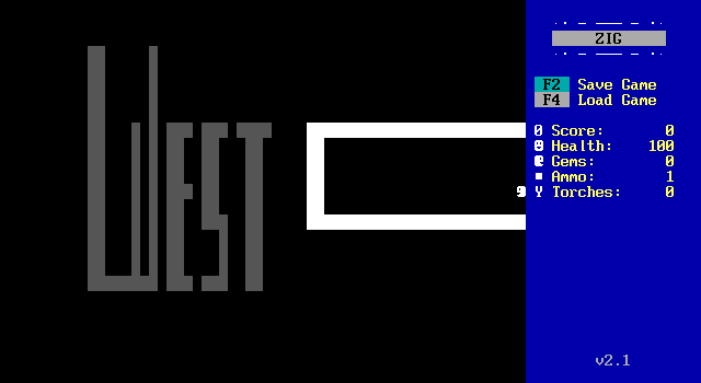
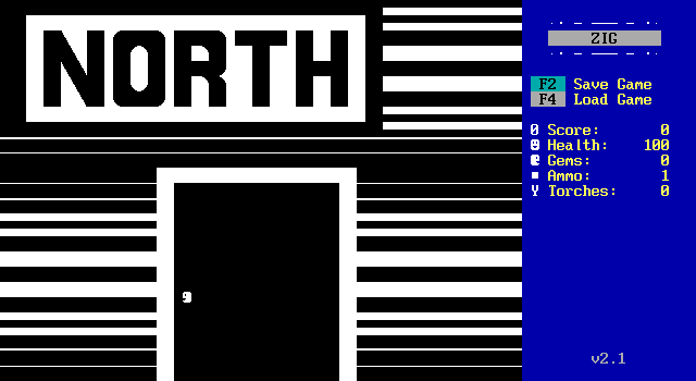
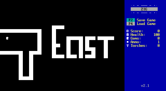
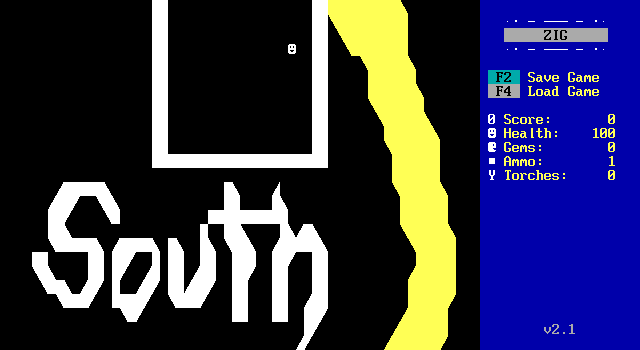
A cute little touch is that the player can be programmed to change its character on a keypress, thus moving and also facing the direction they're heading in.
There's not a whole lot to it really.

This demo showcases ZIG's improved audio capabilities. With support for mod files and waves, you can create sounds without any real limits (other than your poor 56k dialup Internet connection downloading it all).
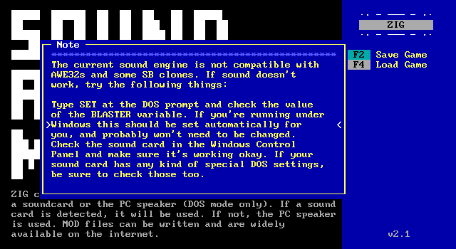
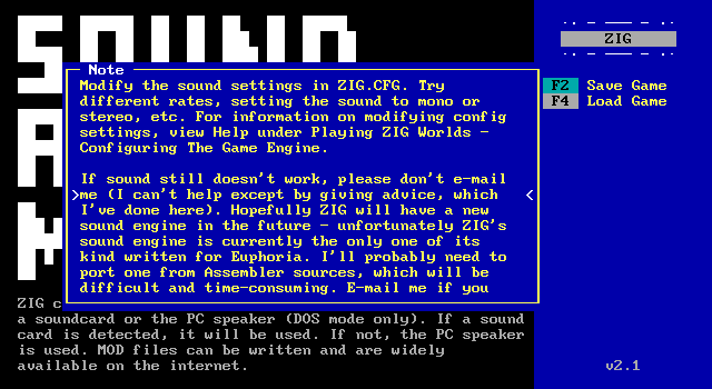
And here we run into our first big ZIG problem. Its audio engine is not a very good one. ZIG was notorious back in the day for sound not working for anybody but Hammond. It should have been a big improvement over ZZT, but instead ZZT's PC speaker effects reigned supreme by virtue of working.
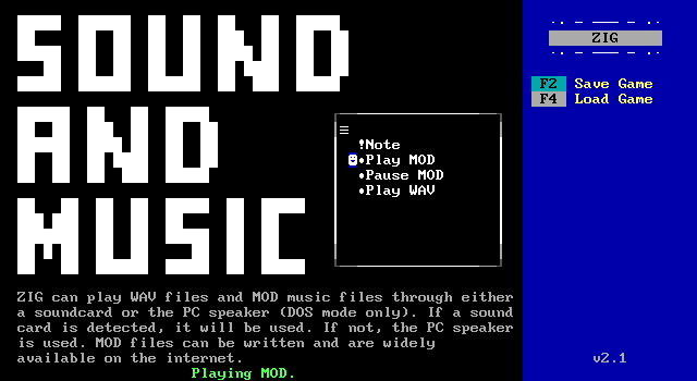
No sound plays.
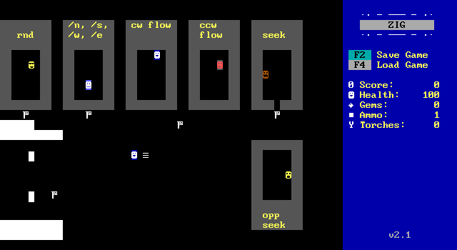
Directional Operators is the title of this demo, and it's pretty much all the same as ZZT's. You've got random movement, cardinal directions, clockwise and counter-clockwise flow (where a walking object rotates which direction it walks in), and of course seek and opp seek for chasing down or escaping from the player.
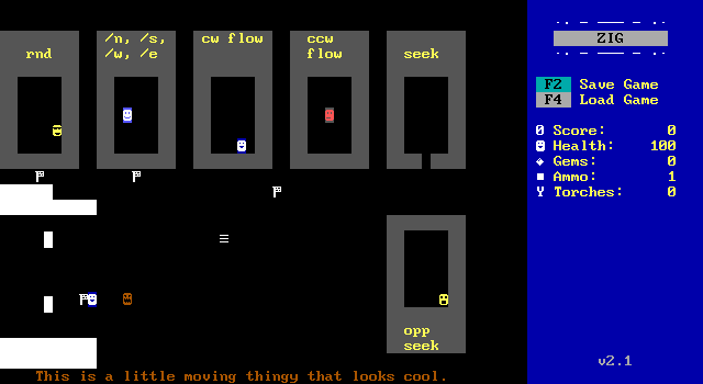
The seek monster can be let out and hunt down the player, and there's also this effect that looks like pixel based movement rather than tile based that's done by manipulating the board's character set while it's running, shifting rows of pixels upwards. The effect can be used to handle some simple animations like this, but ZIG is still fixed to a grid.
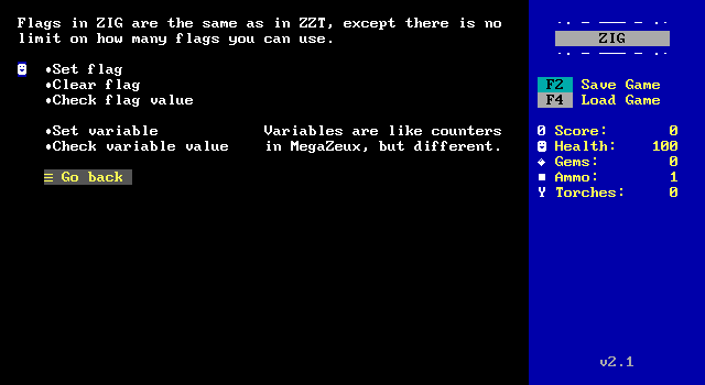
Flags and variables are next. Flags are on/off values just like in ZZT, but there is no set limit on how many are supported. Similarly, there are variables which can be set to integer, decimal, or string values. MegaZeux at the time had a limited number of counters, another instance where ZIG actually outperformed the alternatives.
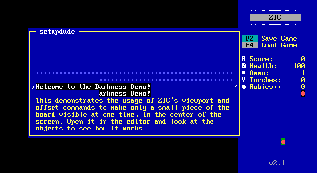
Our next demonstration is scrolling and viewports.
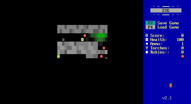
As you'd expect, the demo consists of a room where only a fraction is visible at any given time.
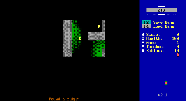
It's a vast improvement over ZZT's dark rooms, and has the added benefit of being adjustable in code, letting a game dynamically change how much of a board is visible. In order to escape the maze, the player is supposed to collect all the rubies and give them to an object.
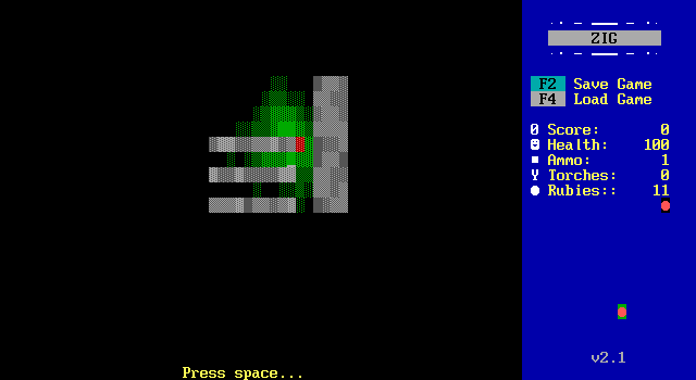
A small gray object runs across the floor and ran into me, reducing me into a pile of blood and guts.
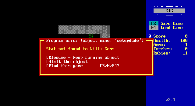
And then an error occurred. ZZT will play a sound and display a message when it encounters an error, but afterwards the object just fails to continue running. ZIG offers some alternatives with continuing to execute, stopping execution, or ending the game entirely, making things much nicer for debugging.
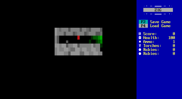
Also I gain the ability to move around a a pile of guts. \m/
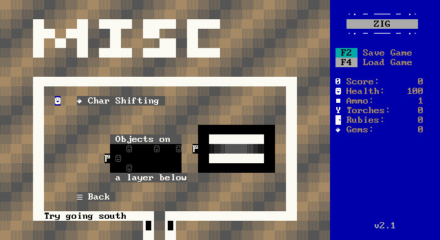
The final demo is simply miscellaneous.
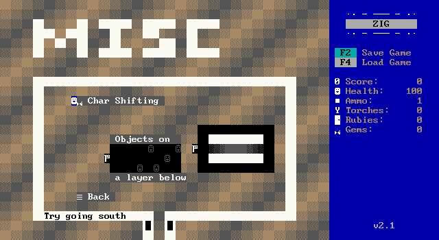
Character shifting is shown again, touching the gem causes its character to shift one pixel horizontally and one vertically.

There are some objects on a lower layer, which move randomly but can simply be walked over by the player.
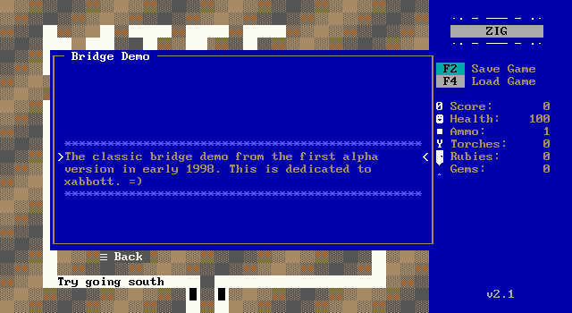
There's also a bridge!

You can go over the bridge.

But also you can go under the bridge!
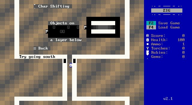
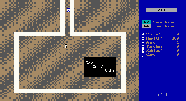
Lastly, there's an effect where when moving south, rather than fixing the camera to the player, it instead pans its way down after the player reaches a certain coordinate. This simulates the behavior seen when going from room to room in Zelda game.
And that's all for the demo itself! Before moving onto our next title, let's take a quick look at the editor.
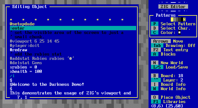
Here we see the setup object for the viewport demo. Its code style is very similar to that of ZZT-OOP, with a few instances of adapting usabilty features from MegaZeux. The choice of colors is pretty messy here with comments in a nearly unreadable black on dark blue.
You can see a viewport command for resizing the visible area to a pair of coordinates, and commands for manipulating the HUD and assigning some values to variables. The #addstat command also has the character to show on the HUD selected by providing a string. In ZZT, the #char command which changes an object's appearance requires the numeric value for that character which can make code hard to read, and requiring lookups to find the number to write in the code as well. External editors like Kev-Edit offer character selection tools where users can select the character they want from a grid and have the editor insert the numeric value for them.
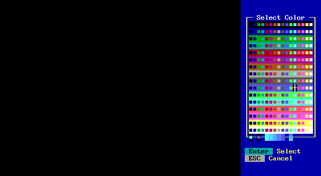
The color selection is the complete range of all 256 possible combination of foregrounds and backgrounds. High intensity backgrounds are supported rather than ZZT's unfortunate insistance on blinking allowing for some very vibrant combinations not normally possible.
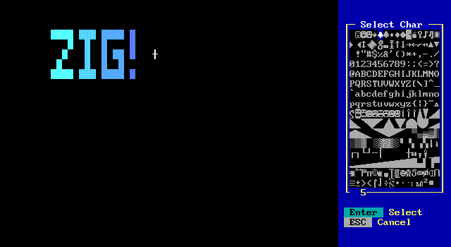
I draw some walls, of which the usual solid/normal/breakable/water patterns are represented. However, any character can be made into a type of wall here. This also gives us our first overview of ZIG's default character set. Some ASCII characters have been altered to fit in with how they've been used in ZZT such as the club and spade glyphs becoming two sizes of trees. ZZT's door character is very much a door now. There are a lot of different smiley faces covering those with bigger eyes, monsters, shocked expressions, and cool dudes in sunglasses. Plus a few snakes!
Of course, ideally ZIG worlds would be editing graphics for their own purposes, so a lot of what else is included consists of generic building blocks for various slopes, curves, and dithering.
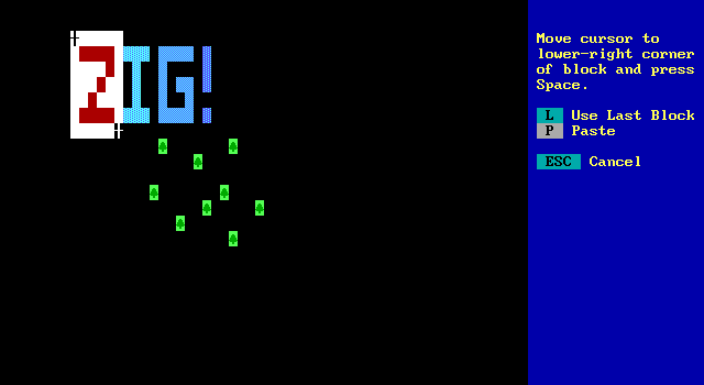
Another feature of ZIG is the ability to highlight blocks and act on them. They can be copied and pasted, but it's also possible to highlight a region and update everything selected to match the currently selected color or character.
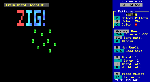
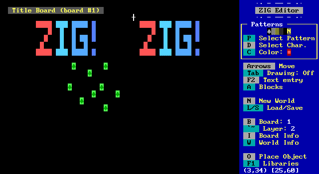
I'm jealous that Kev-Edit doesn't have support for the color/tile replacement functionality, but it does have copy/paste as well as support for non-rectangular selections.
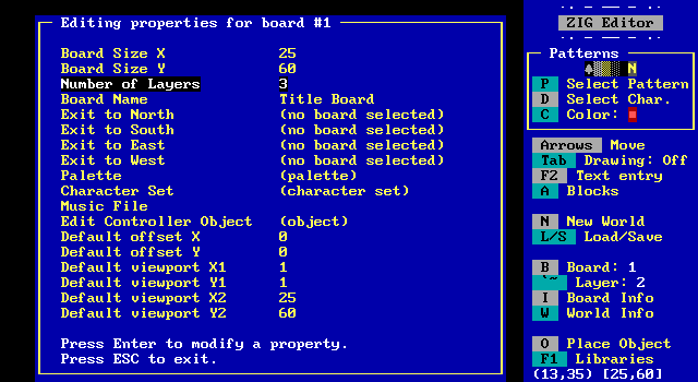
The board information lists a good amount of properties, sizes, offsets, viewports, layers. You can specify a music file to automatically play on the board rather than having to make an object for it.
There's also a "controller" object which is somewhat like MegaZeux's global object. This is a per-board object whose code runs, but isn't actually on the screen anywhere. Compared to ZZT's habit of leaving the pieces of its engines scattered into every corner, ZIG provides a more elegant solution.
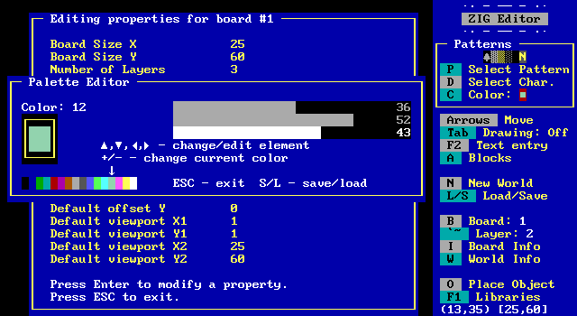
Tools for palette editing are built right in, with RGB components being adjustable sliders from 0-63 for a total of 262,144 possible colors, though like ZZT and MegaZeux, only 16 can be displayed at once.
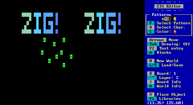
I replace red with a sickly zombie looking green and the board updates accordingly.
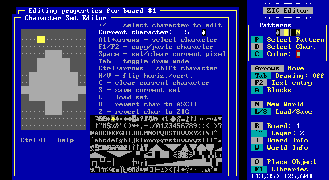
The character editor can be used to manipulate the graphics, and save them to a file for an object to load again later. It has all the cools you'd expect and the luxury of hotkeys to revert characters to both their ZIG default as well as their original ASCII display.
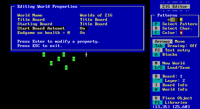
The world can also be modified a bit, allowing the world to have a proper name rather than ZZT's filename display, and setting which board is the title screen and which is the starting board. ZZT always sets the board that was saved on last as the starting board, and ZIG offers this as a toggle. Game overs can also be disabled as well if the person making their game wants to handle it manually, perhaps using a system of extra lives when health is depleted.
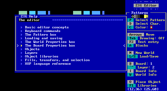
ZIG is very well documented at the very least, AKWende is credited with writing the manual which is very thorough and does an excellent job going through all its new commands compared to ZZT.
We can come back to the XOP language at the end, for now let's move on to our next ZIG world which is also included with ZIG itself.
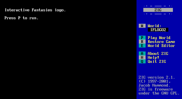


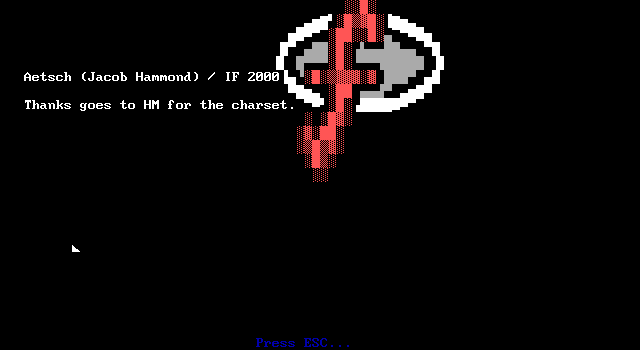
There's a simple tech demo of the Interactive Fantasies logo the ZZT/MZX company used at the start of several of their MegaZeux games. I bet if the sound worked it would even play their little https://www.youtube.com/watch?v=6L2lsvbSgH0#t=9m17s" target="_blank">company jingle.
It's a simple example of what MegaZeux can do, but putting it in a more ZZT environment, it serves as a good example that ZIG is still plenty powerful.
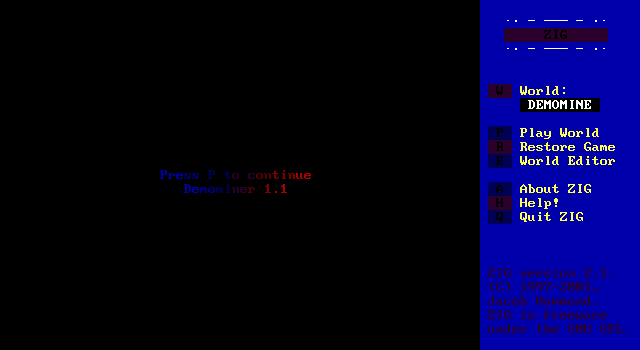
Next up is Demominer by MasterTMC. Flexible palettes are used to make some barely legible text! With great power comes great responsibility.
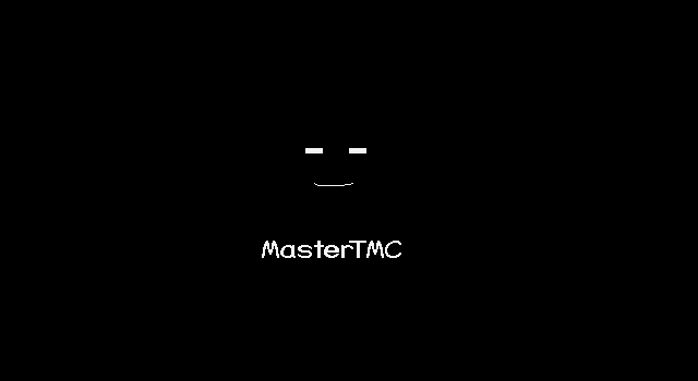
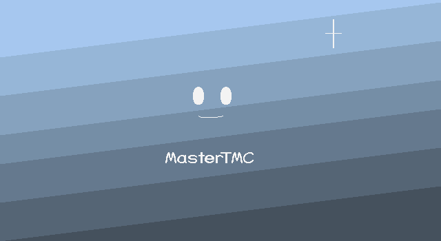
Upon starting the game, a MegaZeux style intro plays with a smiling face being drawn and a blue-gray background fading in with a few twinkling sparkles.
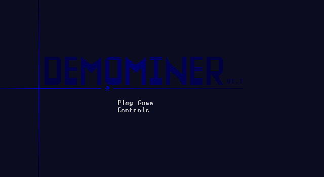
The main menu gets right to it, with the only choices being controls and playing the game itself. I have no idea what I'm getting into here.
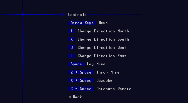
The controls make it sound like something that might be like Bomberman?
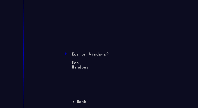
There's also this interesting prompt for which OS you're running ZIG under. The game's text file says to be sure to pick windows if you're running the game in a non-fullscreen window. I have no idea why that would make a difference.
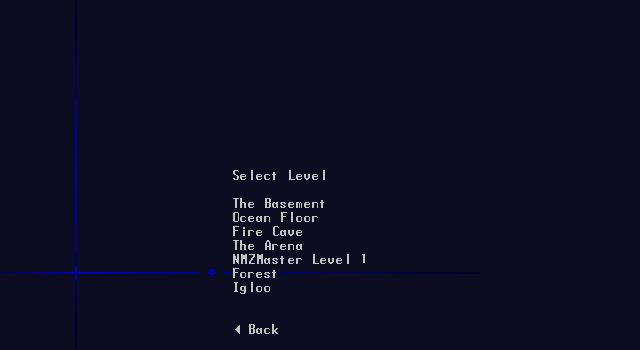
Lastly is this level selection. There are quite a few choices here, and I picked the forest stage for no particular reason.
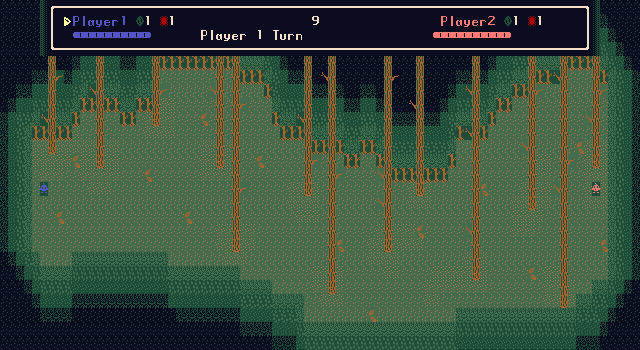
The forest stage lives up to its name, with a red and blue water drop looking thing on opposite ends of the map and some trees that can be used as cover to hide behind.
Before I can do anything, I am immediately taken aback as a mod file begins to play! This is the first time I have ever heard ZIG produce audio in my entire life.
https://www.youtube.com/watch?v=djqOGuay2hg" target="_blank">tipituf.mod
Give it a listen. In fact, if you want a true ZIG experience set it to loop.

Demominer is revealed to be a 2-player turn based deathmatch game. Each player takes turns moving or dropping bombs. These actions take action points shown on the HUD above. The goal is to kill the other player first.
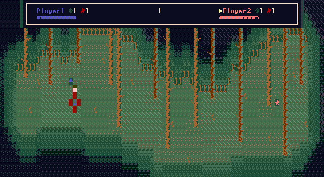
Bombs have a fixed timer and you can't get very far from them before they explode so it looks like it's far wiser to drop a bomb before moving rather than after.
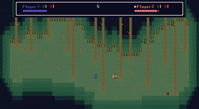
I play around with it a bit, but it's not very fun, and I doubt having an actual second player would do much to improve it. The game's controls are very slow to react and there's a lot of health to burn through. Powerups do spawn to give bazooka or remote mines, but moving is such a tedious process that I wouldn't want to chase them down. I think actually playing this would result in both players getting within range and than trading blows until whoever attacked second lost.
It's worth noting however, that though this game works perfectly fine locally with two players sitting at a keyboard, it's actually designed with online multiplayer in mind! Now, ZIG doesn't actually have netplay capabilities on its own, but around this time the ZZT community briefly toyed with the use of a screen and keyboard sharing program, Microsoft NetMeeting, to turn these games into online experiences. Keep in mind this would be screen sharing in an era where a large number of ZZTers would still be on dial-up.
NetMeeting was generally proposed as a way for two ZZTers to collaboratively create a ZZT world together (which sounds like a nightmare with two people sharing the editor), but with ZIG it offered a chance to make games feel that much more modern via crude, laggy, netplay.
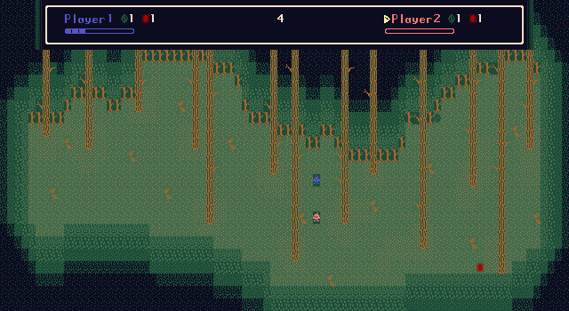
Eventually I let player 1 win the game and it just stops. No indication that somebody won, just suddenly the objects can't move. There isn't even a warp back to the main menu. I'm forced to quit and move along to our next title.
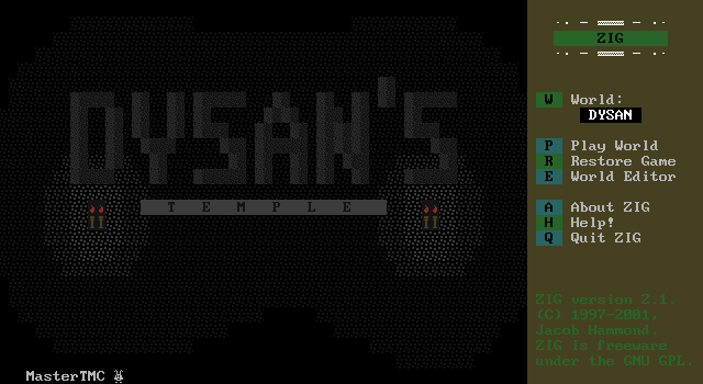
MasterTMC is back again with Dysan's Temple and Dysan's very dark palette.
Oh. By the way, tipituf.mod is still playing despite a new world being loaded.
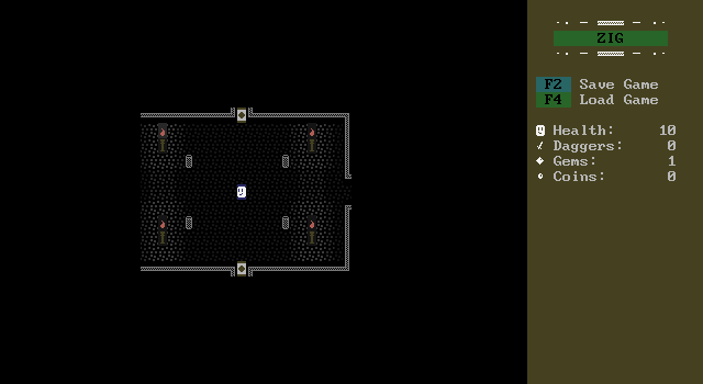
Dysan's Temple is an arcade style dungeon crawler. Not exactly Gauntlet, but with enough similarities that it would seem like the best comparison. The player explores the temple going from room to room collecting gems, coins, and daggers while fighting off monsters.
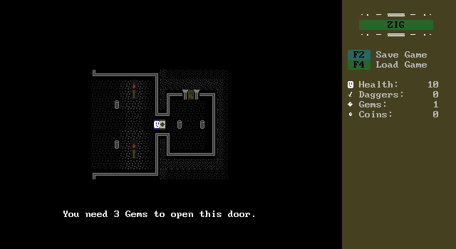
Gems are quickly revealed to be used to gate progression through the game as three of the passages from the starting chamber require a certain amount of them to be opened.
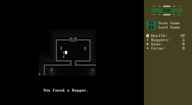
The northern branch is open and has a pile of daggers for the player.
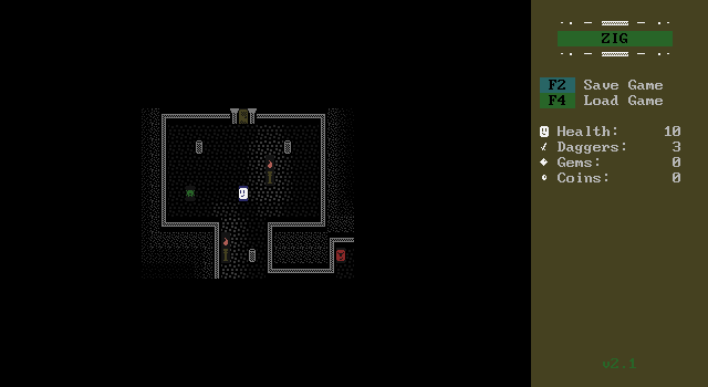
The dungeon is full of monsters which can be defeated by throwing daggers at them. It only takes one hit to kill, but their number is limited, and there's a windup as the dagger is thrown making it very tough to hit enemies that aren't charging after the player.
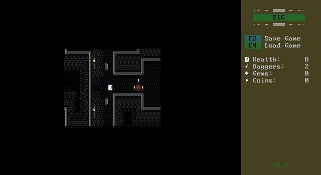
Killing an enemy will cause them to drop coins which spin like you'd see them doing in a modern Mario game.
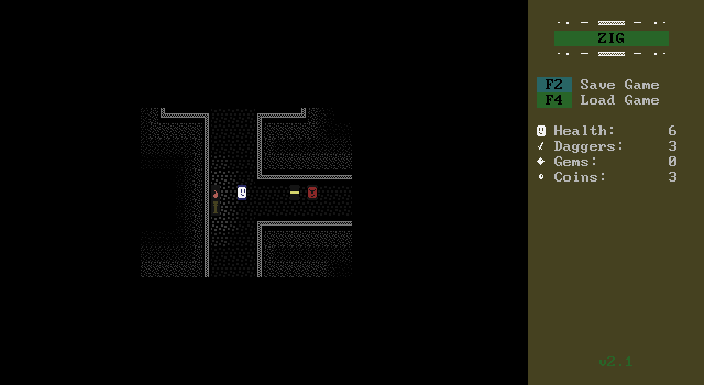
The game gets very difficult very quickly as these red enemies shoot bolts of energy at the player when they're lined up.
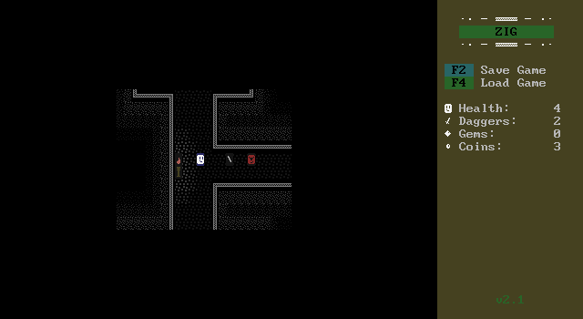
Daggers will destroy the blasts and keep traveling, but the enemies fire much faster and the player is locked in place during the dagger throwing animation. If the windup was faster and the daggers were more prevalent this could actually be a fun little game. It's a simple concept but it does a good job of showing you what can be done with ZIG, and this sort of combat isn't something you could do in ZZT.
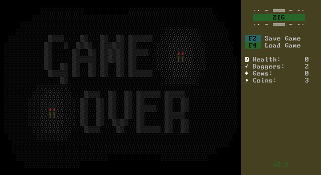
But as it stands its not long at all before the player gets overwhelmed and killed, where they're transported to a game over screen.
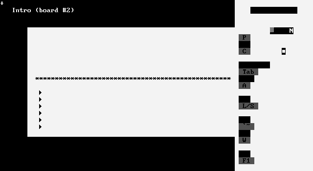
One very frustrating flaw of ZIG is that the program has to use the game's palette for its own UI, which leads to situations with unusable interfaces as colors become impossible to navigate menus with.
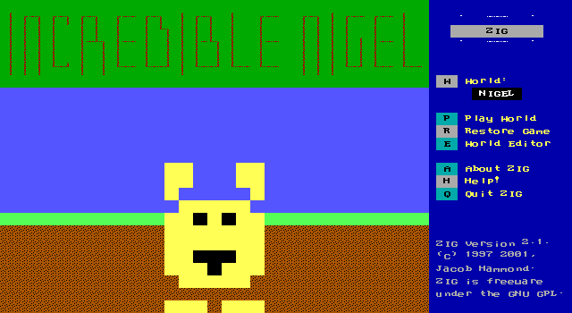
Our next title is "Incredible Nigel" by Twigz. This is their only release for ZIG as well as ZZT, and doesn't do much to instill a sense of quality from its title screen.
tipituf.mod continues. Always and forever.
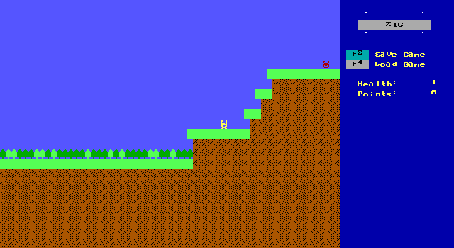
Nigel is a cute little character and an incredibly badly written sidescroller. Sidescrollers exist in ZZT and MegaZeux. In ZZT they're very rough as the engine doesn't have a lot of the tools you'd need to make a proper platformer. MegaZeux fares better, with its player not needing to touch objects that send messages to other objects telling them how to move and jump. More modern MegaZeux sidescrollers can use larger sprites to create a more smooth feeling experience, but most still use a single tile on the board and feel very rigid due to sticking to such a low-res grid.
ZIG should be capable of doing what most basic MegaZeux games did, but this game manages to feel worse than sidescrollers in ZZT even. Pressing up jumps, but with no horizontal movement at all. I had to look at the game's text file to figure out how to make it up a ledge.
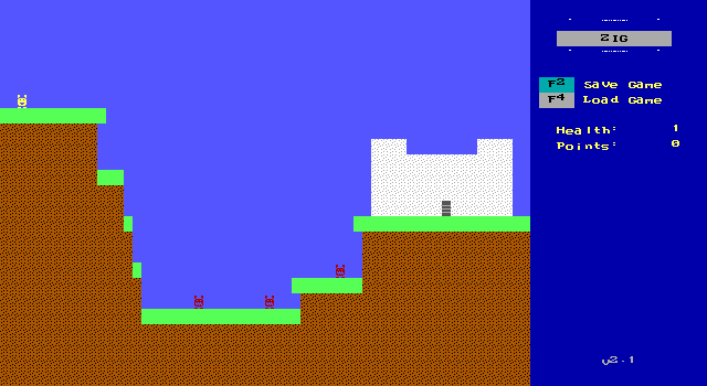
To jump horizontally, the player has to hold left/right and then press jump. Then they'll jump straight up just as before, but then take two steps to the side before they begin their descent. This makes for some incredibly slow jumps with no player control over their height or distance.
The manual says you can press down when you land on an enemy to kill them, but I was never even able to time a jump to land on an enemy to begin with. Instead I'd wind up alongside them and get hit for one damage.

One of the objects managed to push me into solid ground. Thankfully I was able to leave it, and it's not an issue specific to Incredible Nigel as it happened in various better coded ZIG titles as well.
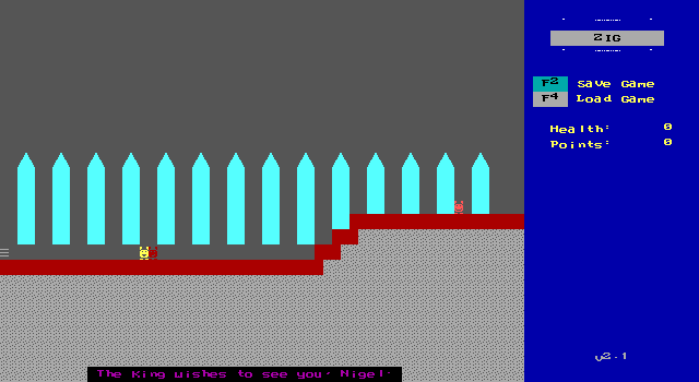
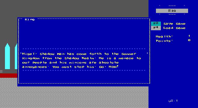
Upon entering the castle the player is treated to the game's barebones plot.
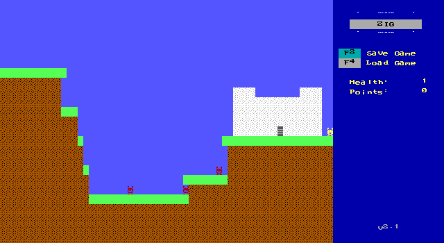
This path also leads to a dead end. I have to go all the way back to the start and left from here to continue Nigel's quest.
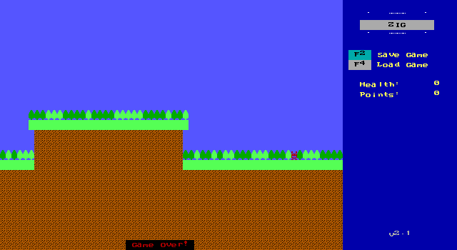
West of the starting area are more monsters and some trees. The bright green trees are in a foreground layer meaning Nigel and the enemies can't be seen behind them which leads to blind jumps hoping your timing is good enough to pass over them.
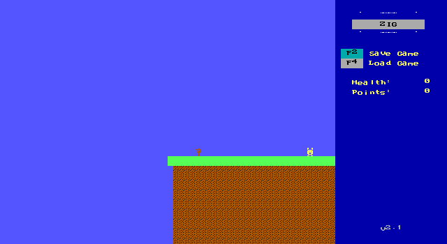
I persevere because somehow this is still the most playable ZIG title so far.
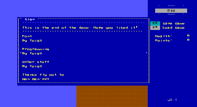
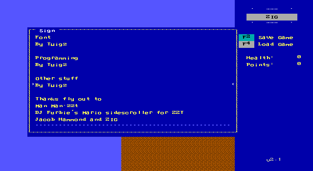
The credits mention a ZZT platformer for the engine, but on checking said game's engine doesn't lock the player's trajectory like this one does.
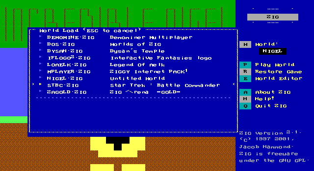
Next on the list is one I'm really curious about, Star Trek: Battle Commander.
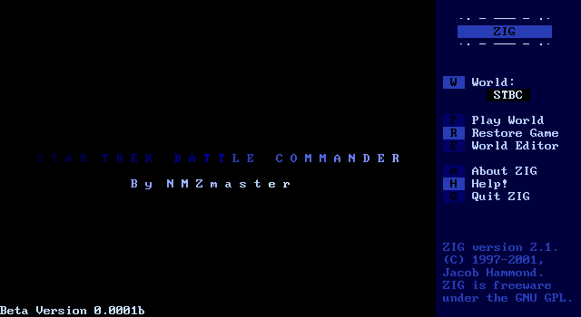
NMZmaster's Star Trek: Battle Commander is the most ambitious of the ZIG worlds available. I was excited for it, expecting it to be a port of the vintage BASIC Star Trek game. It seemed like it would be possible to replicate in ZIG and would be a real show-stopper in terms of complexity.
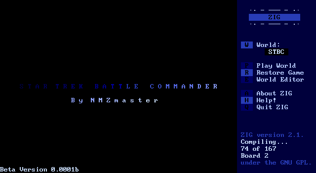
The compilation time before the game can actually be played takes a moment. For the other titles it's been near instantaneous or done in just a few seconds, but this one actually takes a bit of time to load. Still nothing to absurd to wait through, but not what you'd expect from a ZZT clone.
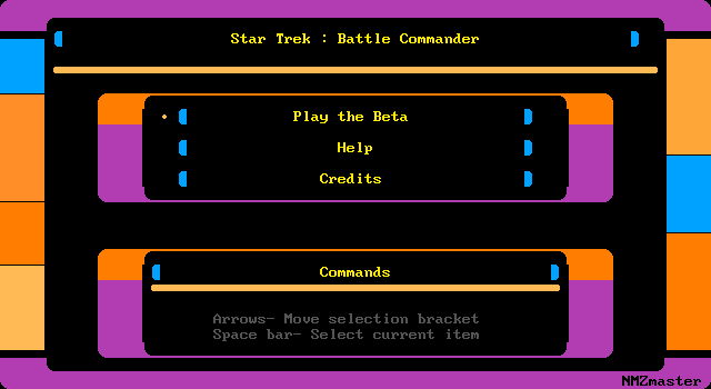
The game's menu mimics the Enterprise's own systems.
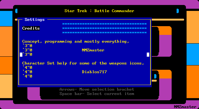
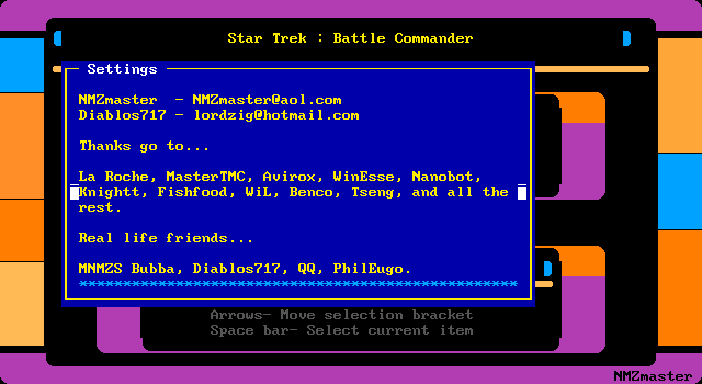
The credits show off the non-functioning coloring methods for text and give a few shoutouts to various folks.
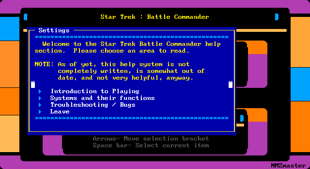
The game's documentation lays plans for a thick tome.
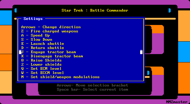
The controls show quit a bit of complexity. There's a lot to do here.
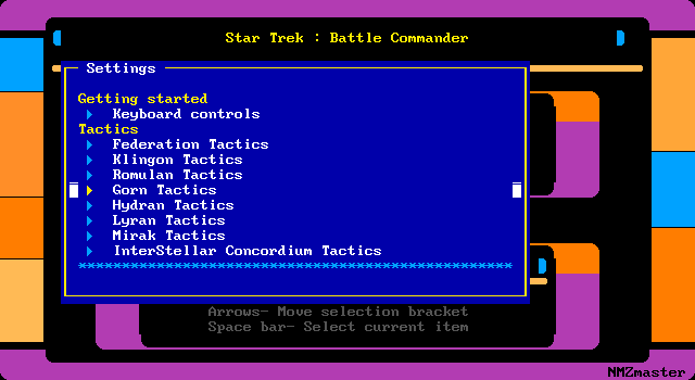
None of the tactics sections are implemented, but it again sounds like this game should have huge amounts of content available with all these different races available.
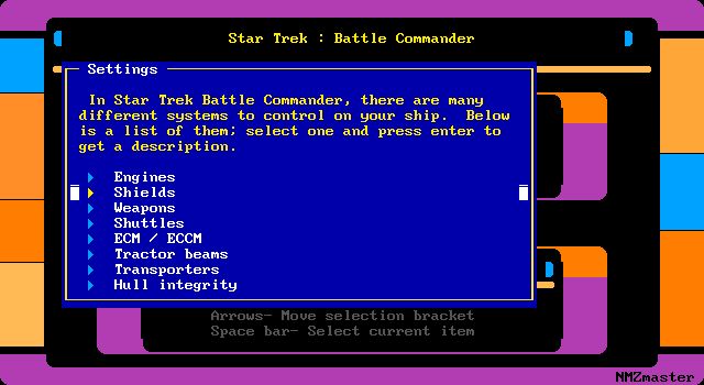
It's frankly overwhelming. Thankfully none of this stuff is actually written other than the engines which work as you'd expect, increase or decrease them to change speed.
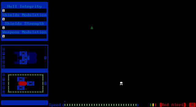
The game itself places the Enterprise into combat immediately. There are clearly lots of stats and information on this HUD, but I'll be damned if I can tell you what any of it means.
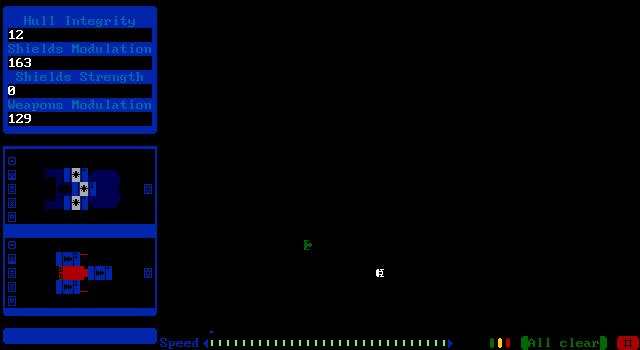
The enemy ship moves in towards my own while I'm still fumbling trying to so much as move around anything other than extremely slowly. ZIG's keyboard handling XOP causes some issues with responsiveness. If an object is moving at cycle 5, it will only check for input every 5th frame making it difficult to even get menus opened as input will usually just get dropped at the end of each frame.
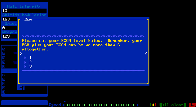
I have no idea what ECM or ECCM levels are.
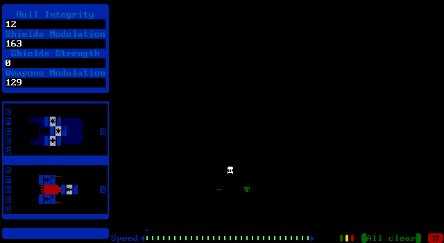
EVASIVE MANEUVERS
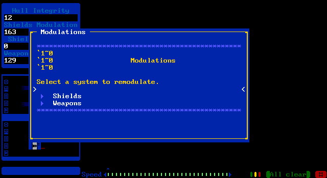
I need to fight back and modulate my weapons?
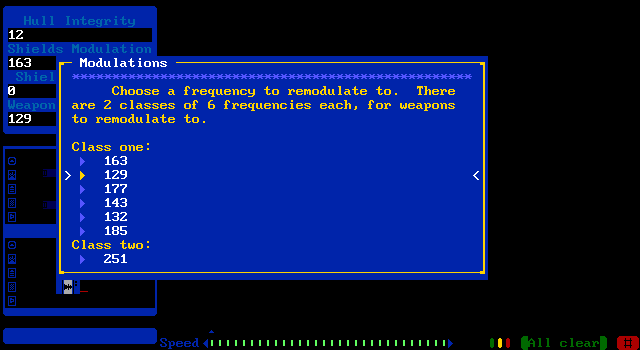
What am I looking at?
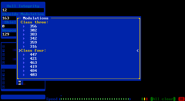
I. Do. Not. Understand.
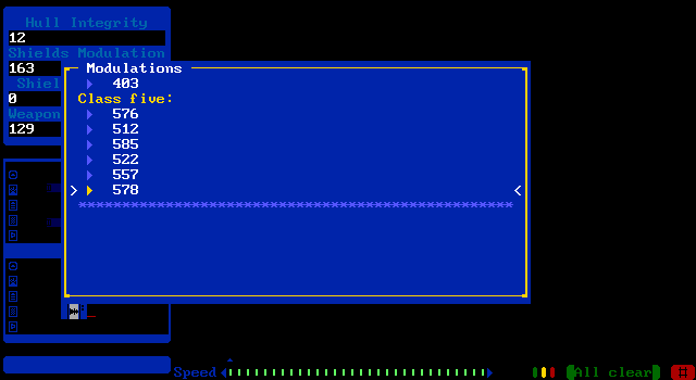
I AM NOT GOOD WITH COMPUTERS
As much as I flail around I cannot figure out how to attack the enemy, but this seems to put us on even ground as the enemy ship never fires at me ever again.
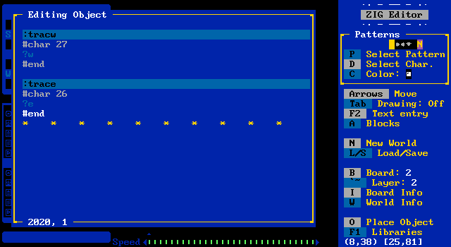
I crack open the editor, curious what the code for all this looks like. And it looks like this. The Enterprise ship has more than TWO THOUSAND lines of code.
There's clearly a ton of work put into this, but it's completely obtuse and the lack of any of my button mashing have a visible effect leads me to believe that if I had more than a cursory knowledge of Star Trek that it wouldn't be any better.
Or maybe I didn't modulate properly. I don't know. I'm getting out of here.
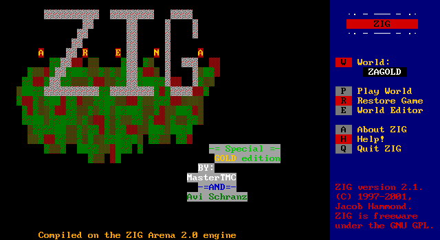
None of those strategy games for me, I'm up for some straightforward deathmatch with MasterTMC again, this time accompanied by Avi Schranz in ZIG Arena GOLD
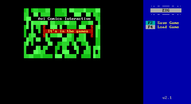
Oh yeah, tipituf.mod is still going.
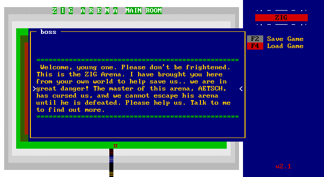
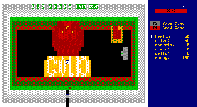
ZIG Arena is a singeplayer arena shooter that is very clearly inspired by Quake 3.
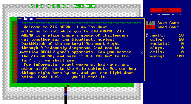
The goal is to defeat all the opponents to escape from the arena, and use money earned from the fights to buy better weapons and ammunition.
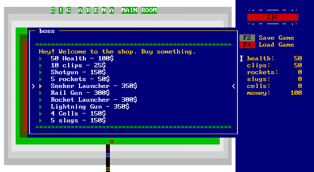
Plenty of weapons and ammo to purchase, though not enough starting money to get anything but more clips. Also shotguns use clips in this game.
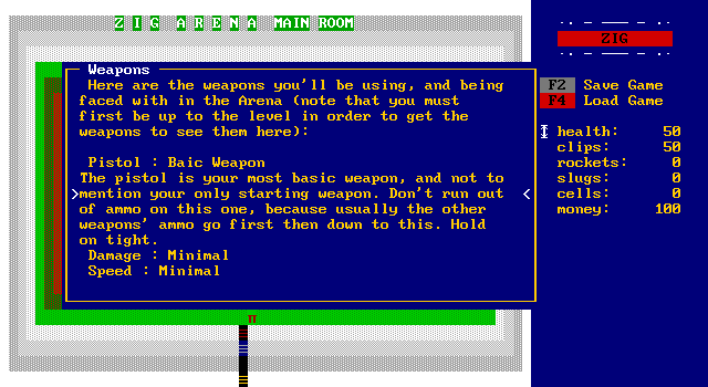
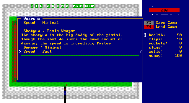
Another object tells the player about the weapons available. The shotgun is the big daddy of the pistol.
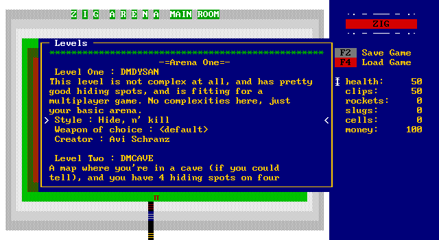
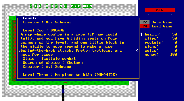
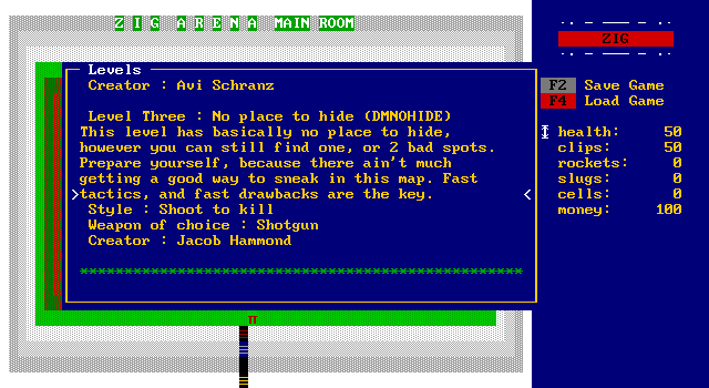
Can I tell you, the typo "tacticle" is really good?
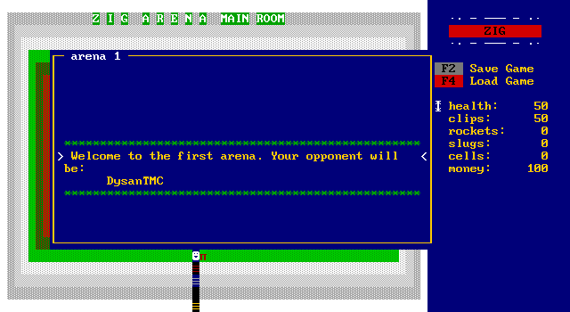

I head to the arena to face off with my first opponent. He moves diagonally throughout the arena, bouncing off walls at a 45 degree angle and shooting when lined up with the player.
The sheer size of the board makes it very easy to avoid him so there's no trouble with staying alive.
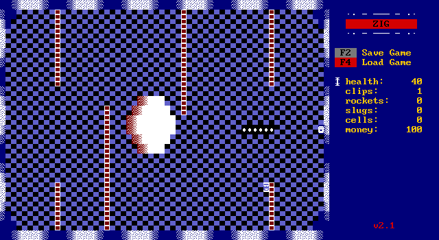
Unfortunately that also works in reverse making him extremely difficult to hit. He has infinite ammo.
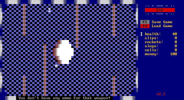
You don't. I did hit him a few times, but there's no indication for doing so. This game is a mess.
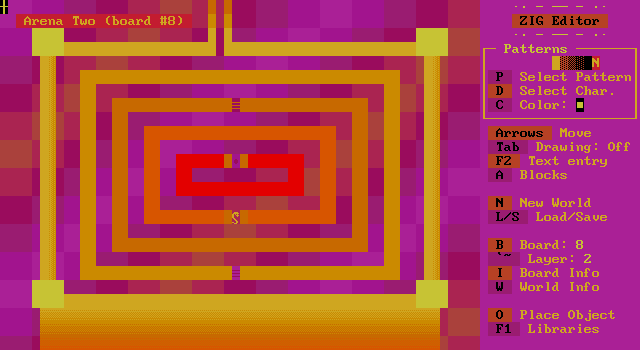
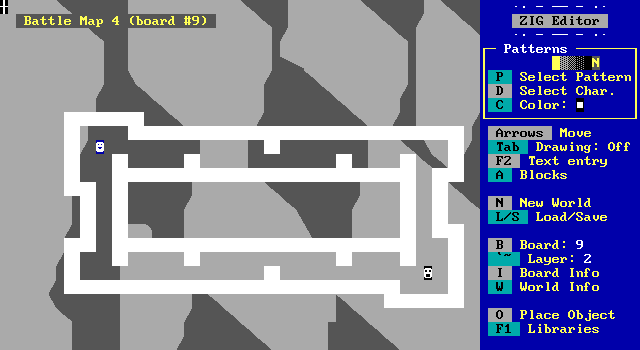
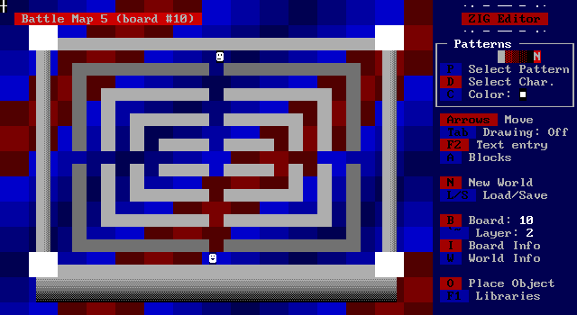
Some of the backgrounds for the other arenas are pretty cool looking at least.
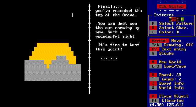
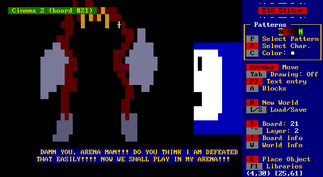
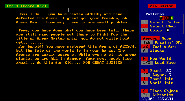
The ending, not so much.
And look, it took us this long for something called ZIG to be hit with a reference to All Your Base!
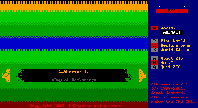
Oh, but of course ZIG Arena actually has a sequel. A single digit number of titles released (and I'm being generous since they're almost all just demos) and we managed to get a sequel.
I feel like there should be something in the top half of this title screen rather than just a gradient.
Some more introduction logos that feel like they had more time put into them than anything in ZIG Arena did...
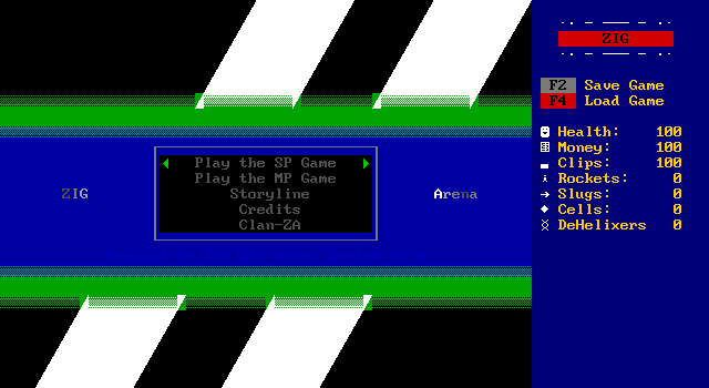
The sequel is an improvement though.

Well, mostly. The objects highlighting the selected option immediately desynced on me like this. The credits are mostly the same, but I can't wait to hear about Clan-ZA.
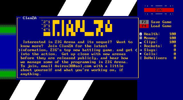
Again the broken color formatting strikes, ruining the ASCII art. Sign up for the clan and get to beta more arenas for the series.
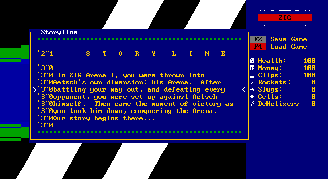
The story rehashes the previous game pretty quickly.
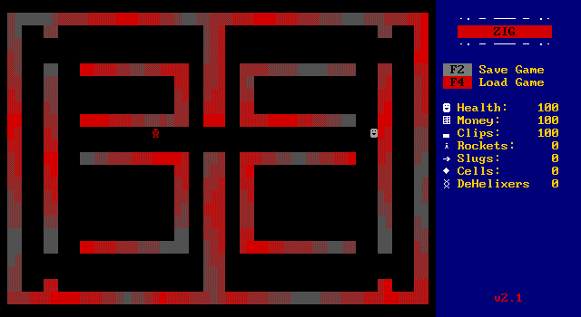
On starting the game, a cutscene of the previous game's final fight replays, with the player shooting a rocket at this red lion guy.
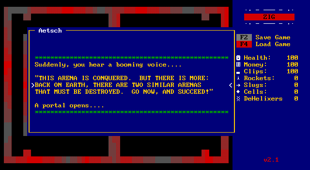
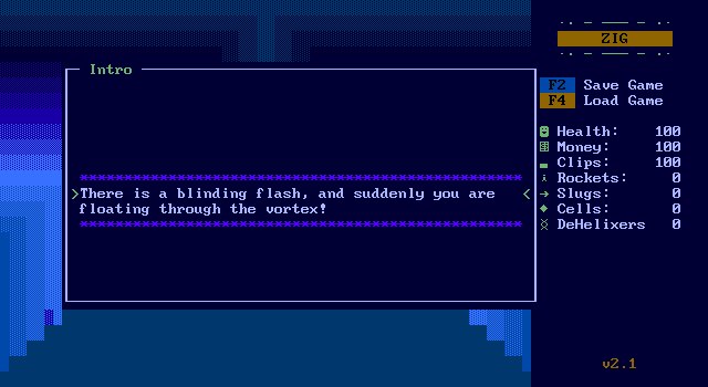
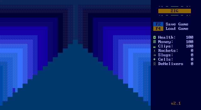
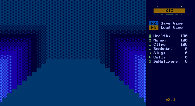
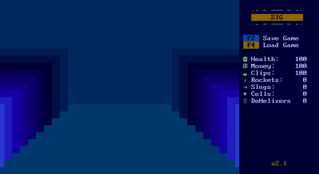
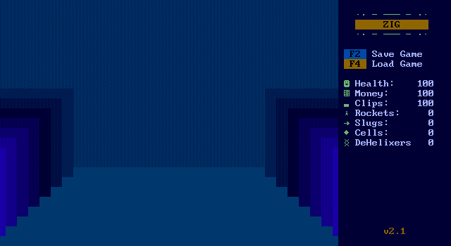
Not gonna lie, I do like the depth effect here as the illusion of being drawn into the screen plays out.
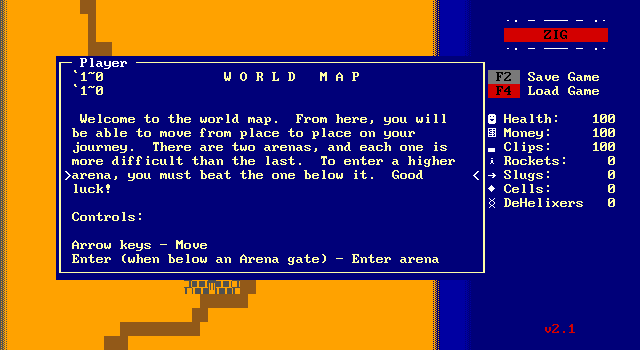
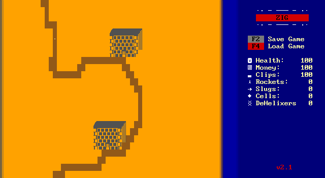
The player is taken to this hideous looking world map where two more arenas need to be conquered.
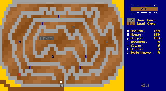
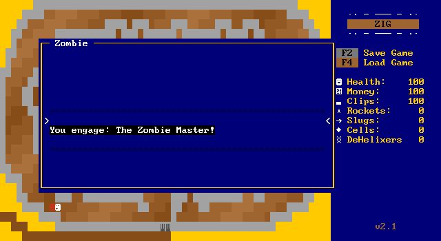
Inside the arena the player needs to challenge each opponent to move onto the next. It's pointless structure that keeps the player out of the action.
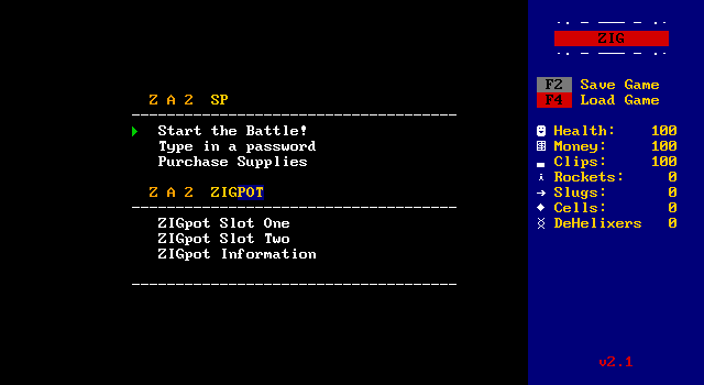
On challenging the first enemy the player is warped to another menu with the new store interface and some interesting new features.
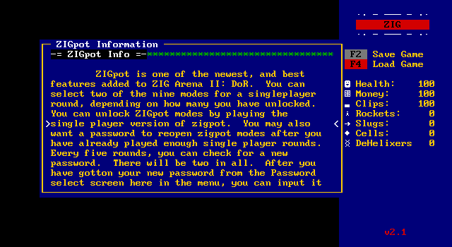
There's a system called ZIGpot which can let the player essentially add mods to the game, unlocked by defeating foes. A password system is also implemented to let the player save their progress.
I guess it hasn't come up yet, but ZIG doesn't have the ability to save games implemented. A password system is the only way to track progress, and this is honestly probably the biggest issue against its adoption.
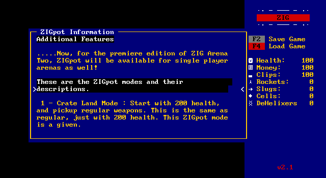
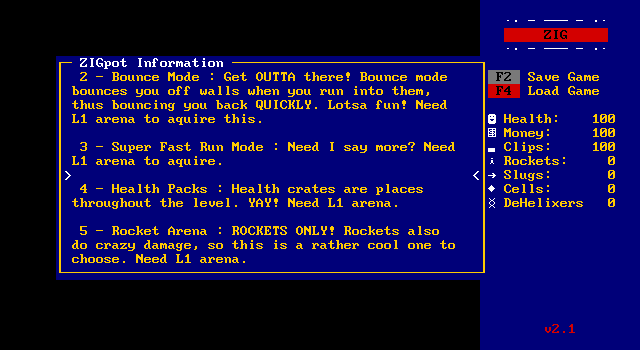

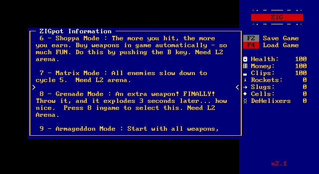
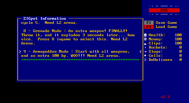
There are a whole lot of options to unlock, but only crate mode is available at the start. This is a shame because I feel like being able to play fast and rocket mode would do a lot to mitigate the issues with the large board sizes and difficulty hitting targets the original ZIG Arena had.
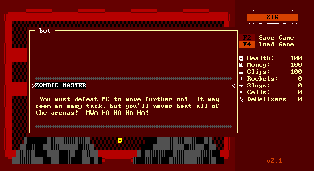
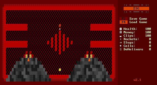
The first arena is a fiery one with volcanoes the erupt regularly, spewing damaging lava.
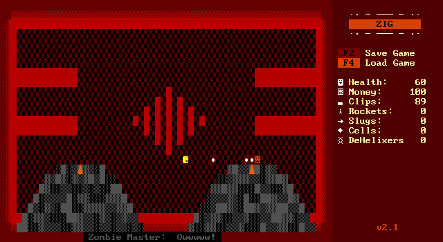
There's also indication that you're hitting the enemy successfully. A little feedback goes a long way.
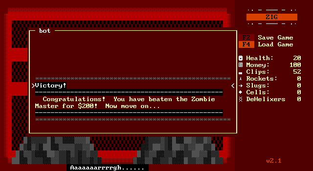
I actually win a fight! It's still not fun though. I'm warped back to the arena and have to walk across the room to the next opponent.
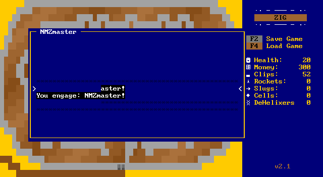
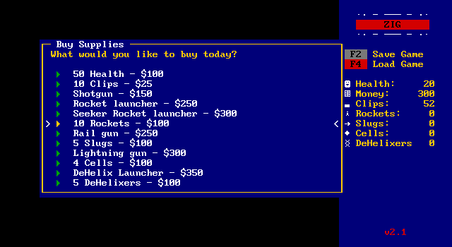
I really wanted to buy a rocket launcher, but wouldn't have had any money for rockets. Instead I buy a shotgun, some health, and ammo to prepare for the 2nd fight.
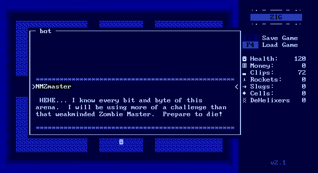
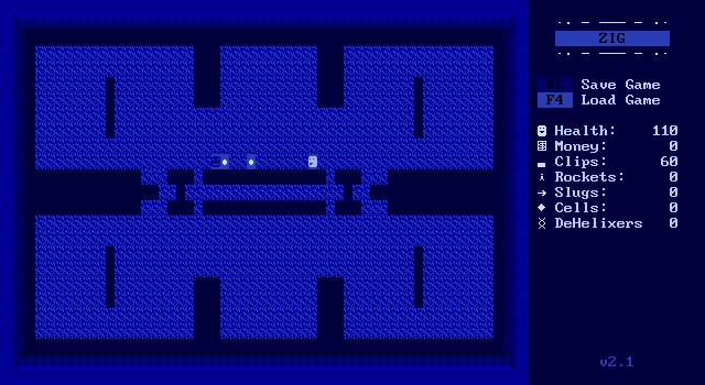
I don't notice any difference with my shotgun, but I did just realize the grenade mode says to hit 8 to select grenades so I most likely had to press a key to switch weapons. Whoops.
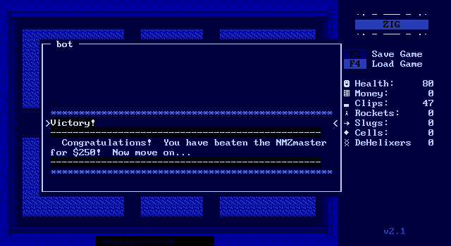
I win a second fight!
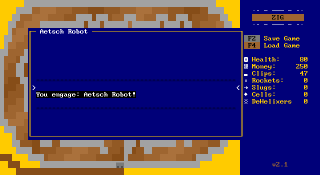
And then I realize this game still isn't any fun, and just because I can make progress in it unlike the first game doesn't mean I should.
It's definitely an improvement over the original, but it's still very tedious and repetitive combat.
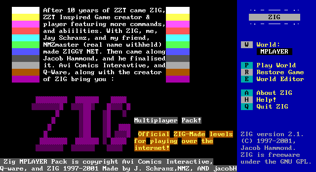
But it's still not over. There's also this pack of multiplayer levels meant to be played online! This pack isn't as complex as the Arena games, with just a single weapon available, and no campaign mode.
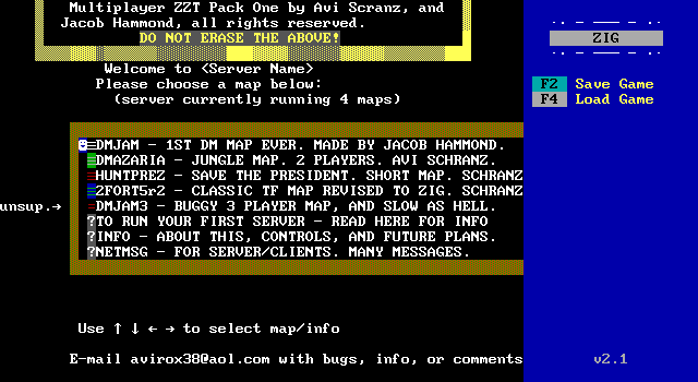
This is adorable! You're supposed to name your "server", and once the players are ready, they pick a map and star up a game.
I immediately jump into 2fort.
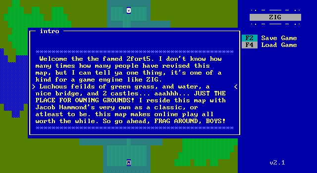
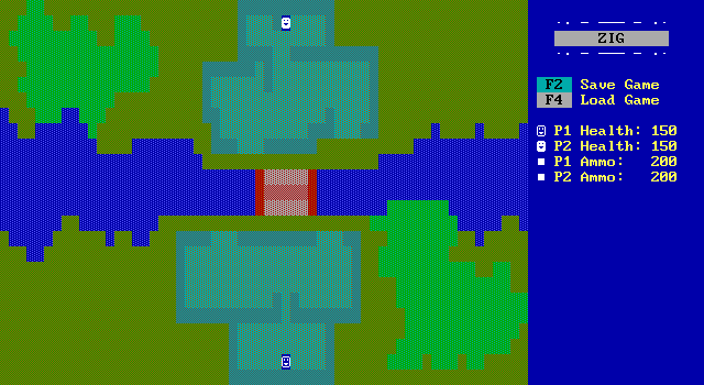
Compared to the ZIG Arena series, the multiplayer pack is a lot more simplistic. It plays no differently than you'd expect a 2-player ZZT to work.
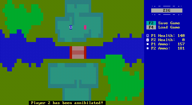
All of these netplay focused deathmatch games are clearly inspired by major players in the FPS market at the time like Unreal, Quake, and Team Fortress. Yet despite this inspiration, the gameplay doesn't even attempt to crib anything more than weapons and maps. This one life with a lot of health fighting is very ZZT when ZIG would've been easily able to implement a point based scoring system with respawns.
Instead, once a player is defeated here the game comes to a stop. There's no victory screen, no way to replay the map, and no way to return to the main menu. From the start these games are trying to bite off more than ZIG can chew, but there's a lot of expected functionality that ZIG could easily do that just goes ignored making what's already no more than a novelty at best even less appealing.
Most of the other maps are similar, though some at least take advantage of board layers to create hiding spaces or add a bit more tension as bullets temporarily vanish from view.
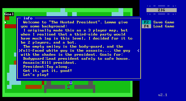
But the game does aspire to something a bit more with its conversion of Team Fortress's Hunted game mode. Here an AI president follows a player controlled body guard who must escort them to the exit without the assassin killing them.
There are interesting character choices here. I feel like a secret service agent would be the one in sunglasses rather than the president, but I guess it keeps things consistent with the other maps' players.
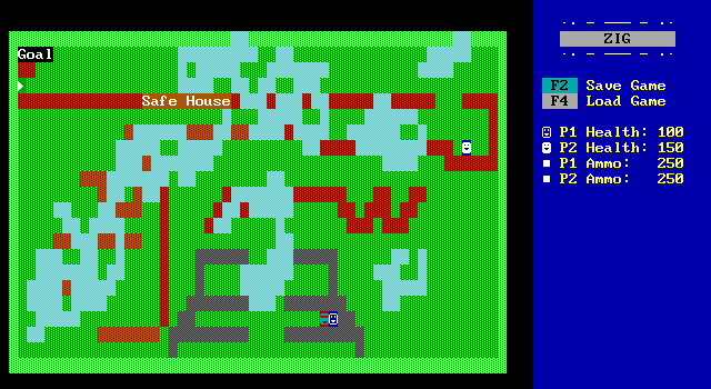
The president unfortunately immediately sabotages everything by moving me into a corner, trapping the bodyguard and making them unable to leave! This sort of pushing around happens in ZZT as well, but can be prevented by checking if the object is next to the player before moving towards them again. This really simple technique isn't used here making it unplayable, and even more so if the player controlling the bodyguard is the one with a 200ms ping over dialup being shoved around constantly.
It does make me wonder if these maps were tested online or if the creators lived nearby and just played on a single keyboard locally.
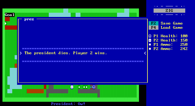
The president also shoves their bodyguard into a solid wall.
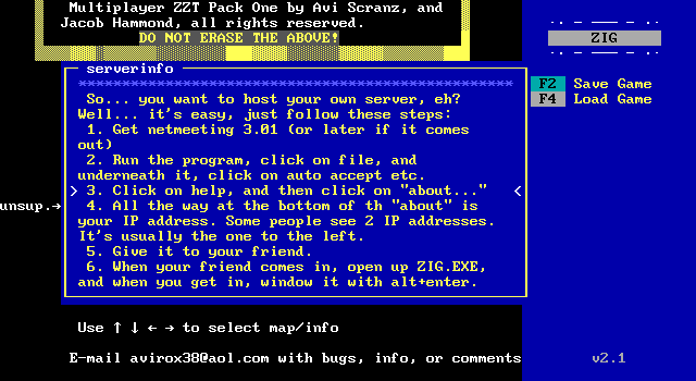
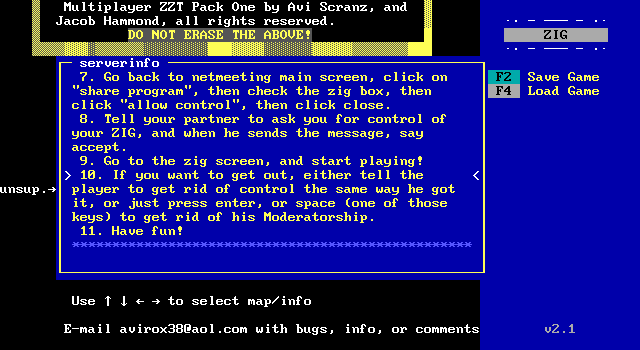
The main menu also includes information on how to play the game online.
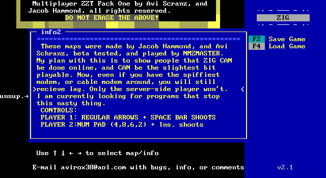
There's also some information about the purpose of making this, and a vain hope to find a program to prevent lag. I love it.
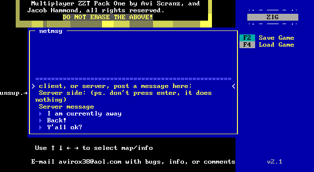
Lastly is this incredibly crude way of communicating with another player by highlighting messages from this list on the menu to let the other player read them.
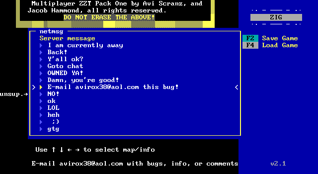
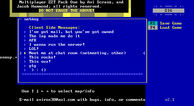
These messages are REALLY GOOD. If I were the type to use textbinds I'd definitely be adding "I've got mail, but you've got owned".
There's just one game remaining, and it's the reason I wanted to feature ZIG this month.
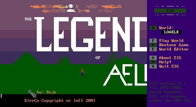
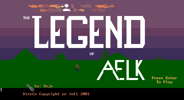
The Legend of Aelk (demo of course), is the closest thing ZIG has to a killer app. It looks good, takes advantage of ZIG's features, and doesn't try to overdo things by falling into the trap of "netplay". It's a singeplayer action RPG that could probably be done in ZZT, but not nearly as nicely.
Kuja (aka Mrs. Clause) partially created a ZIG title that feels like the sort of thing Jacob Hammond had in mind when creating the engine.
There's a flashing company logo, very ZZT but with various shades of pink and purple prior to the game starting.
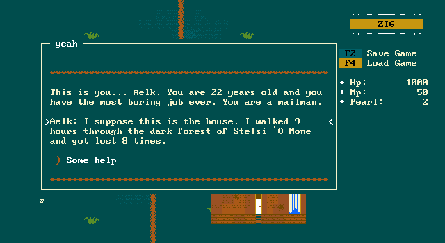
You play as a mailman named Aelk who has a letter to deliver.
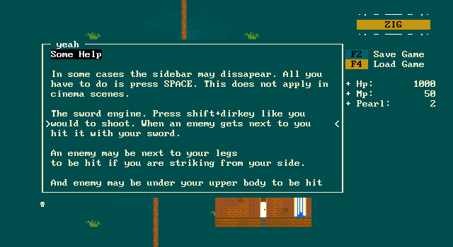
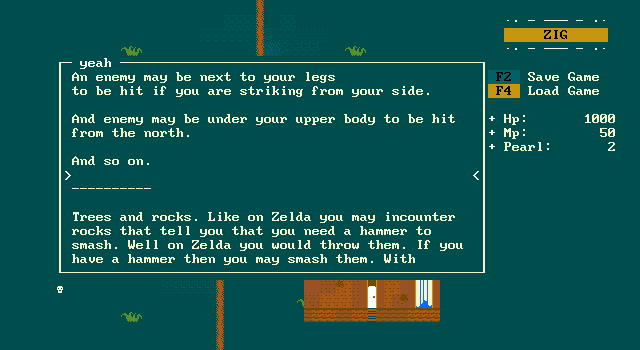
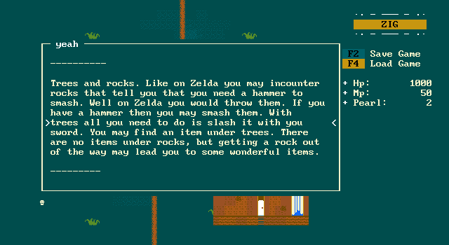
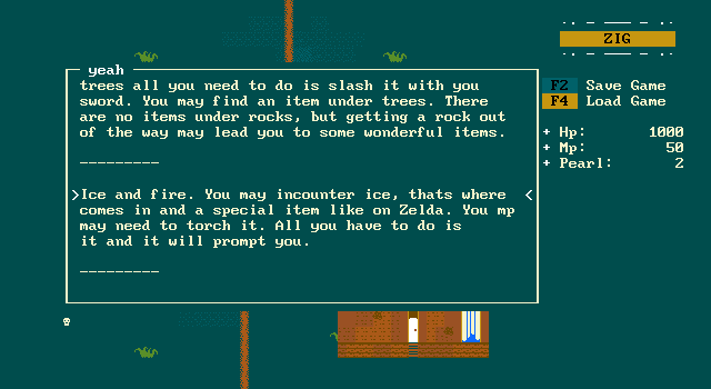
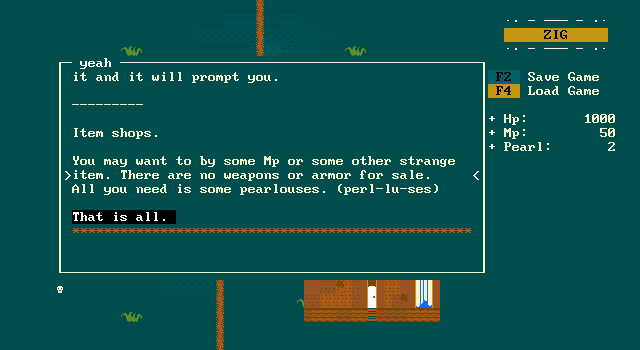

And so Aelk begins with the player taking control of him just before reaching the location the letter's been addressed to. Aelk himself stands out already compared to the other ZIG titles by making use of a 2x1 character. His pants are the main object, what would be the player in ZZT, and his head and body are on a higher layer allowing Aelk to partially obscure what he's walking in front of. It's the sort of thing you'd see in NES titles like Crystalis.
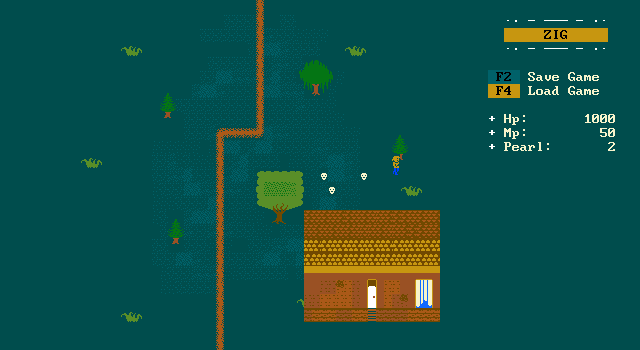
Some skulls hop around after him, and he can stab with his sword to attack them. One complaint is that the sword is only a single tile long which makes combat very dangerous.
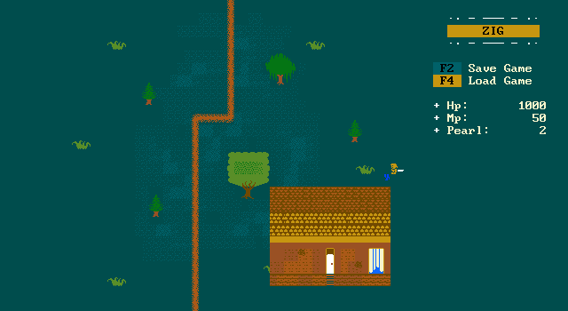
Another complaint is that objects can push the player, severing Aelk. This unfortunately happens quite often. Here Aelk is facing left, stabbing right, and the sword's hitbox is to the right of his pants rather than where the sword actually appears.
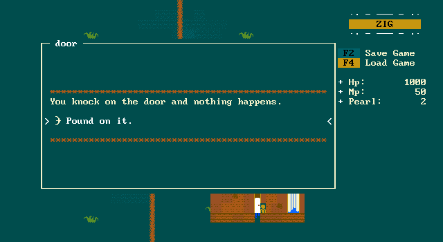
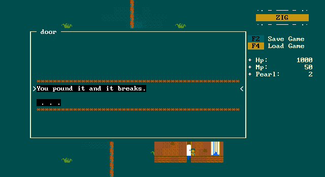
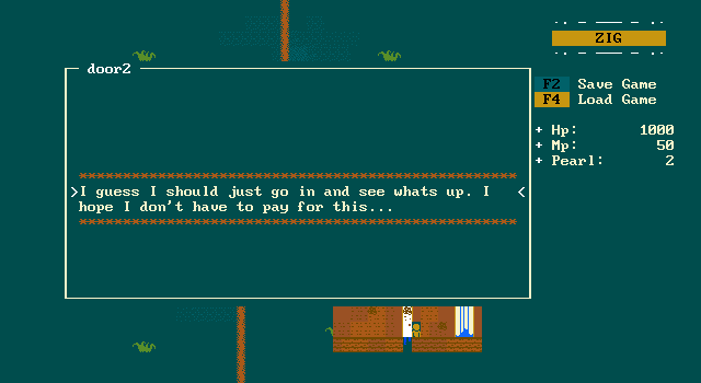
With no response and a broken door, the postman enters.
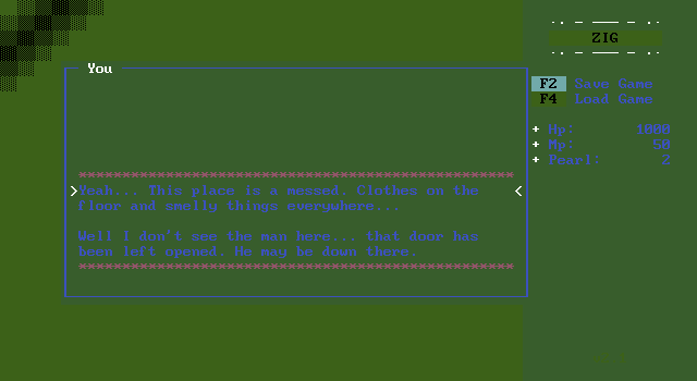
Okay, second complaint, these palettes were not chosen with message boxes in mind. The house is a mess and Aelk can only assume the home's occupant is down in the basement.
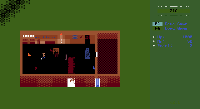
Gone are the blocky kitchens of ZZT. Aelk takes advantages of adjustable charsets to create an actual kitchen with clearly defined counters, cabinets, and shelves. You can even have chairs that face north or south without having to shrug and settle for the ^ and v characters.
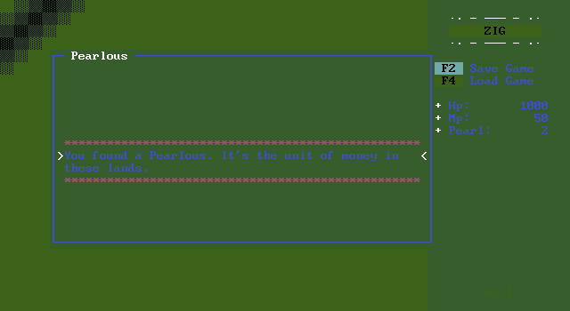
There's a pearl to pick up which is the game's currency, but otherwise nothing else to explore but the stairs to down below. Upon descending the game shifts to a cutscene.
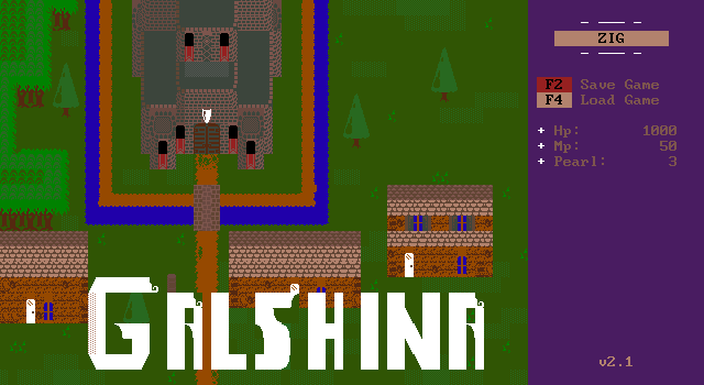
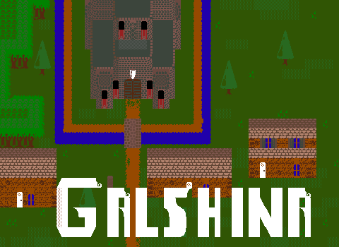
We get a nice overview of Galshina for a moment, and it's a very nicely detailed board. The castle walls and towers look fantastic for something that small. The trees and plants add some greenery and look far smoother than anything ZZT offers.
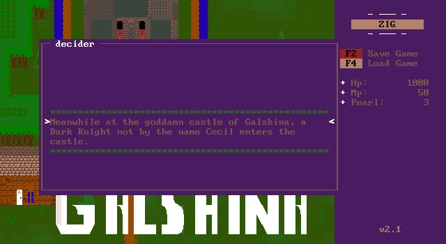
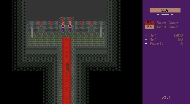
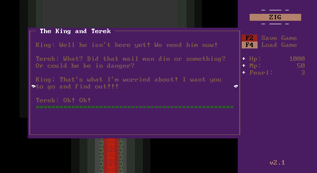
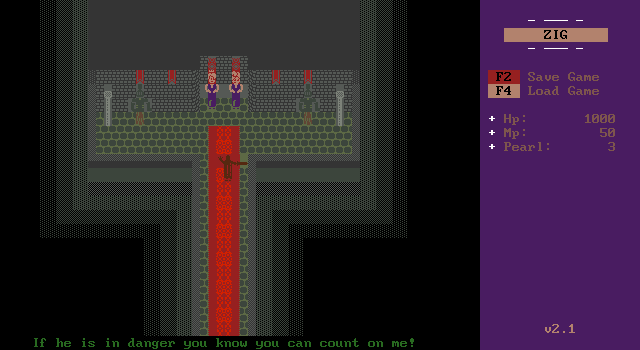
The scene shifts to inside the throne room where the dark knight Terek is called to figure out what's taking the hermit they summoned so long to arrive.
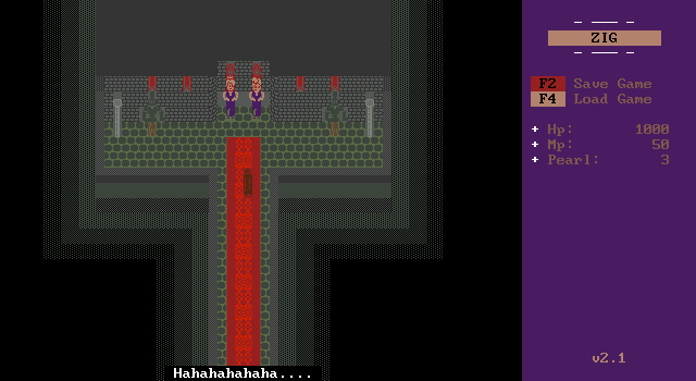
He might be evil.
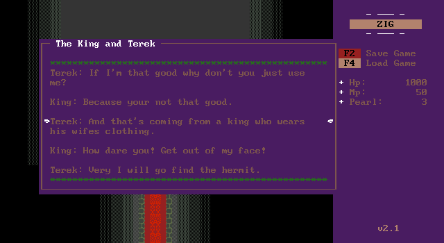
Then Terek calls out the king on having the same body characters used by the queen as well. He's a jerk!
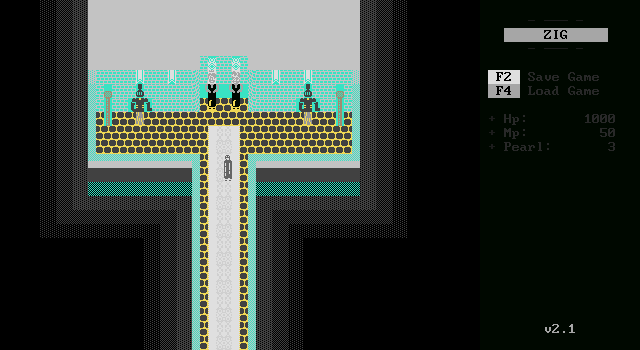
The palette flashes for a moment before the game takes us back to Aelk.
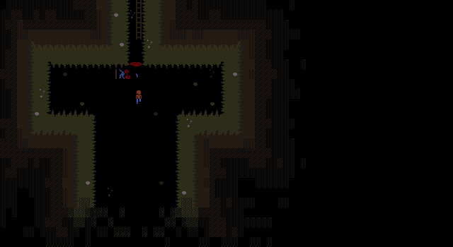
Is it just my monitor? I can barely see a thing here other than Aelk and what looks to be a very dead hermit by a pool of blood.
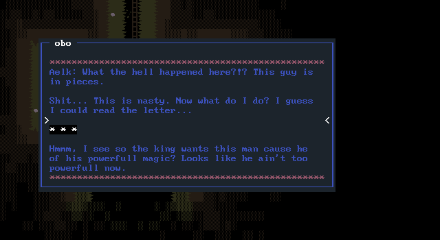
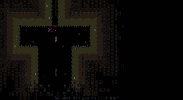
Terek catches Aelk in this compromising location and asks if Aelk killed the hermit.
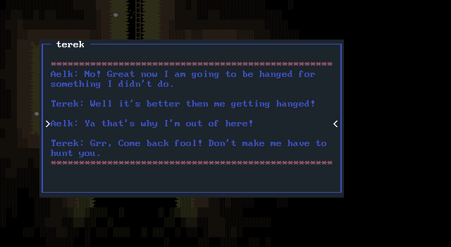
In a panic, Aelk runs off and the game shifts to an overworld screen.
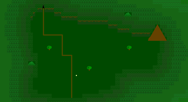
It's a bit sparse compared to the more richly detailed boards for the outside of the hermit's home and Galshina. It's also sparse in content right now, with there only being a single location that can be visited to the north.
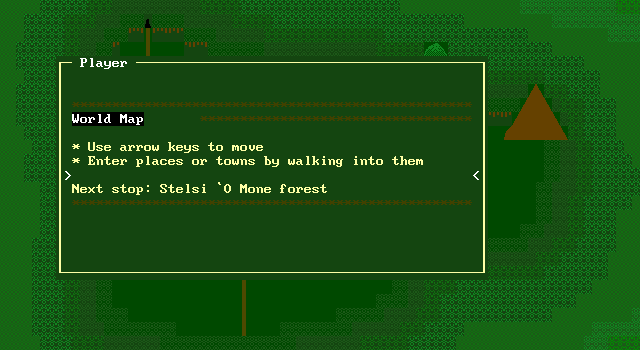
A message explains the controls and Aelk's destination, the same forest mentioned as being a pain to get through in the game's opening board.
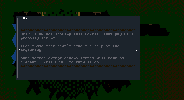
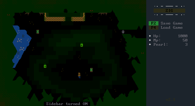
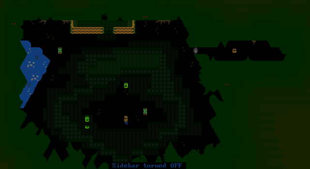
Again the palette is too dark for my tastes. I suppose it is a spooky forest though. Toggling the sidebar HUD allows the player to see more of the screen and discover a chest behind a boulder that would otherwise be obscured.
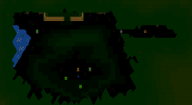
Some small green monsters attack and push away Aelk's pants once more. It's easier to just run than fight as enemies don't actually drop anything.
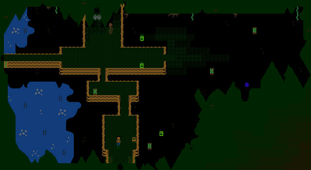
Up ahead are some more monsters, an accessible chest, and another person by some boulders.
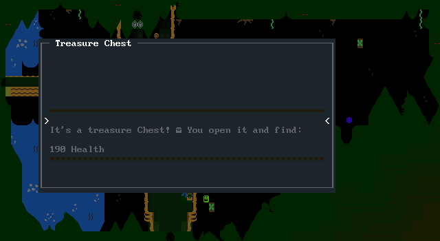
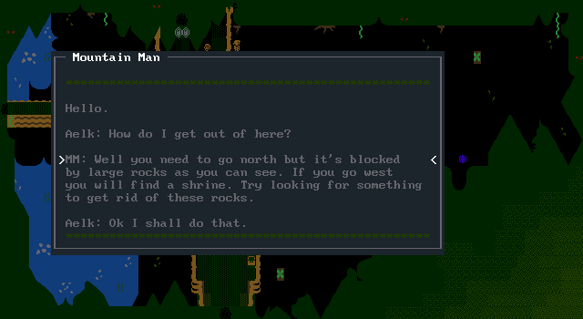
He'll tell the player they'll need to break the rocks to get past, and that an object to break them can be found at a nearby shrine. (Spoilers: It's a hammer.)
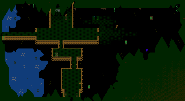
My pants and body are extremely broken by this point because I wanted to get a screenshot of defeating a monster where it animates dissolving away. It's a nice little animation! I'm also fond of the glowing red eyes in the trees.
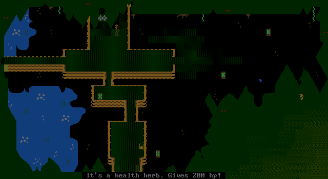
The blue item on the eastern side of the board is revealed as a health herb. Health is pretty much all Aelk will find on this adventure.
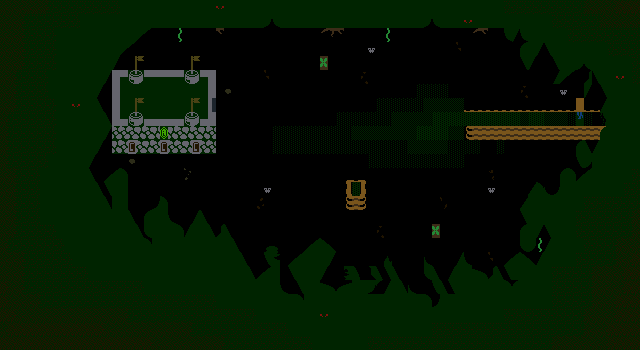
To the west is the shrine entrance, protected by a few flying creatures. It's better to run from them rather than fall apart again.
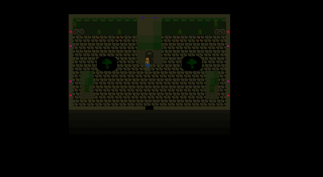
Inside the shrine are some large mushrooms, and decorative statues. The palette manages to get even worse making it very difficult to tell where you can and can't go. There's a barely visible door Aelk is standing in front of here which leads into the next room.
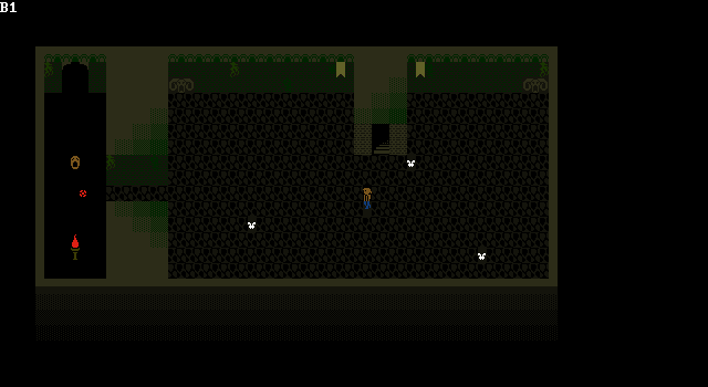
The next screen, helpfully indicated as B1 holds some more flying enemies as well as a brown face which is a newer and stronger enemy. The face can fire a projectile making it the toughest foe yet by far. The red ball here being one of its shots.
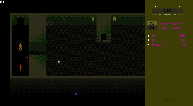
At some point, pants pushing combines with objects pushing things into walls and Aelk's pants escape the confines of the shrine entirely. This basically softlocks the game as there's no way back inside.
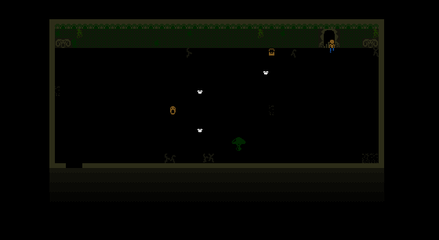
The next screen has another face and more flies? bats? There's also a chest with more health to collect before moving to the shrine's boss.
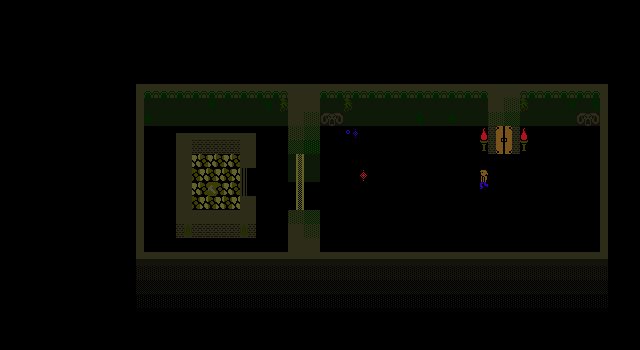
The boss of the shrine is this red/purple looking diamond thing. It takes a lot of hits and changes colors as its damaged.
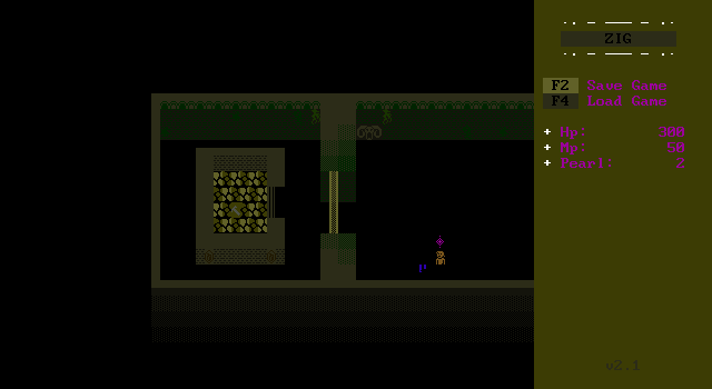
It's not very strong itself however, with only melee attacks that it seems very slow to use.
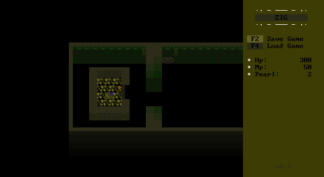
When the diamond is defeated, the shutters open and Aelk can claim the hammer as his prize.
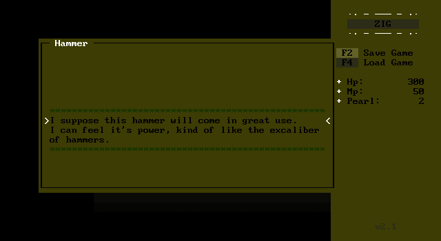
"I suppose this hammer will come in great use. I can feel it's power, kind of like the excaliber of hammers."
It's a good hammer needless to say. Again the palette choices are absurdly difficult to read.
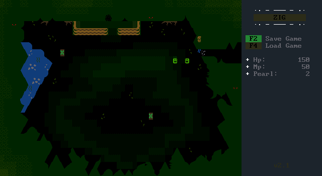
The hammer can smash the rock at the forest's entrance, revealing a chest with 200 Pearlous that can't be used for anything in the demo.
The hammer can also be used to get out of the forest, the other rocks lead straight to the end of the demo here.
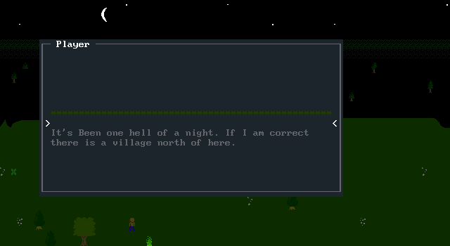
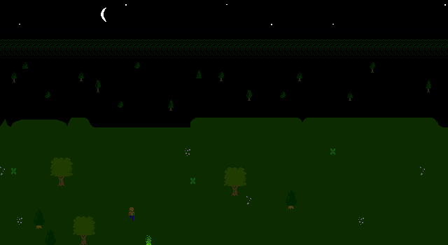
The Aelk demo just comes to a standstill with no closing remarks, just Aelk overlooking a cliff at night with plans to travel onward to the next village.
That's all there is of Aelk, and well, maybe I lavished a bit too much praise on it earlier. Of course, all the other ZIG games have managed to have bad gameplay and bad graphics so one that looks pretty (when you can see it) is a big improvement.
Aelk was a ZIG game that at least felt like its creator had come to grips with what they were doing. It's still a demo, so if work continued after its release I can definitely imagine the palette choices being tweaked to be more visible and not ruin the message windows.
The taller player is a cool idea that breaks too easily, but I think ZIG has enough capabilities that it could also be avoid by always teleporting the head to be above the legs which would do a lot to make desyncs only last for a moment rather than permanently.
Like any ZIG game though, ultimately it sits forgotten.
That's all there is to play around with in ZIG, but before this article ends let's take one last look at XOP to really get a feel for what ZIG would enable ZZTers to do.
What makes ZIG so powerful compared to ZZT is its extended programming capabilities. Let's take a quick look at the commands it adds or modifies from ZZT-OOP:
#addstat name var char
This is how variables are added to the sidebar. Pick a name, a variable to
display, and a character to represent the variable. #delstat can remove a
stat.
#become objectname
While ZZT can have an object become another element, ZIG offers the (not yet
implemented) ability to transform an object into an object defined in an object
library.
There is an included library that for whatever reason wasn't recognized by the editor, but I do remember it working back when ZIG was a new release. It includes recreations of ZZT's player, ammo, torches, keys, doors, lions, tigers, and bears. So people new to ZIG didn't have to immediately code a player from scratch like I would have.
#bind objectname
ZZT's #bind can be used to tell an object to discard its own code, and instead
point to another object's. Good for memory, less good when you realize that
means #zapping labels like objects that take multiple shots to be destroyed
ends up making every single object with that code has its label zapped.
ZIG takes a more practical approach in a world where a decent computer may well have over 128 megabytes of memory and just copies the code rather than pointing to it. This would be extremely useful for action games which constantly hit memory issues in ZZT due to not being able to use #bind effectively.
#bindappend objectname
This one appends code onto an existing object.I'm not sure what the intent with
this is, but I'm sure you can be clever with it somehow.
#change [color] char [color] char
This command is similar to ZZT's but since ZIG only has objects, the match is
based on the object's character. In addition, the colors support can be done
in MegaZeux's style of "cFB" with a hex number 0-F for the foreground and
background, giving it a broader reach over ZZT's seven defined color names.
#changearea x1 y1 x2 y2 [color] char [color]
#change but only to a certain rectangular region on the board!
#char char
Same as ZZT, change an object's appearance.
#clear/#set flag
Same as ZZT, set a boolean flag off or on. ZIG has no restrictions on how many
flags can be defined compared to ZZT's 10 however.
#clone objectname x y
Creates a copy of an object as the given coordinates. In ZZT there is no way
to duplicate an object without waiting for a duplicator to trigger. This could
easily be used for spawning enemies.
#color color
Like #char, but for an object's color. Although ZZT will execute #become red
object, this causes a new red object to be spawned and the current object's
code to be lost. (Using #put s red object and having a different object try to
overwrite the other does work though? ZZT is weird.)
#cycle n
Sets the object's speed. ZIG allows for decimal numbers for more precise control
of speed compared to ZZT where every cycle is ~0.10 seconds.
#die
Destroys the object, just like ZZT, however ZIG prevents the board's last object
from dying.
#end
Stops running code! Same as ZZT.
#endgame
Ends the game's execution until the player presses escape. Same as ZZT if you
ignore the ability to cheat when dead and bring the player back to life.
#fade out/restore speed
Fades the screen to black over speed number of cycles. Having a visual effect
as a single line of code instead of having to mess with palettes makes things a
lot easier. #fade restore will fade back in.
#focus
Sets an object as the focus object. Only one object can be the focus in ZIG,
and that object is the only one that can send :touch messages to other objects
and also is the target referenced when an object tries to #go seek to move
towards what is most likely the player.
#ghost/#solid
Disables collision for an object until #solid is used.
#give var amount/#take amount var [label]
Gives and takes an amount from a variable. This is the same as ZZT and can be
used instead of performing arithmetic.
#go dir (or /dir)
Moves an object! This is the same as ZZT where the object will try to move in
that direction endlessly until it succeeds.
#try dir [label]
Moves an object, but gives up if it can't. An optional label allows handling a
failed move. This is the same as ZZT.
#walk dir
Moves an object endlessly in the given direction. This is the same as ZZT.
#idle (or /i)
Idles for a cycle. Same as ZZT. The manual here says that a single tick is 0.25
seconds, but that has to be a typo as a cycle there is again, 0.10 seconds. ZIG
feels about as fast as ZZT normally.
#if (condition/flag) then (command)
Allows comparing values and jumping to labels or executing commands like ZZT.
The lack of elements means comparisons like #if not any lion nolions is no
longer an option. Similarly, the manual makes no mention of #if contact label
to jump to a label when adjacent to the focus object. This command may actually
be more versatile in ZZT.
#lines 25/43
ZIG actually supports changing the text mode from a 25 line mode to a 43 line
mode.
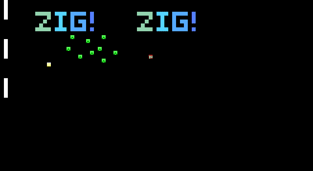
This causes only the top 8 pixels of a character to be rendered, but the same character set is used. The idea of square characters is a good one, but ZIG's implementation of it doesn't seem very friendly. The manual also warns anybody who uses 43 line mode to remember to switch back to 25 when the game ends.
#loadfont filename.zch
Loads a font. This allows for even more dynamic graphics if 256 characters
aren't enough.
#loadmod modname.mod
Loads and plays a MOD file. If you're lucky enough to hear it.
#playmod/#pausemod
Plays/Pauses the currently loaded MOD file.
#move x y [layer]
Moves the object to the specified coordinates and layer. Object teleportation
like this is completely impossible in ZZT.
#movetoboard board
Moves the object to a different board. ZZT has a player on every board which
is moved around as needed when switching boards, but here you can move anything
anywhere.
#offset x y / auto
Sets the board's view offset for camera panning. Auto centers the view on the
object that called it. I'm surprised there isn't a command to center it on the
focus object.
#playwav filename
More sound! This time for wav files.
#lock/#unlock
Locking an object prevents it from receiving external messages until it is
unlocked. This is the same as ZZT.
#restart
Jumps to the beginning of the object's code, just like ZZT.
#restore/#zap
Zaps a label, preventing it from being matched next time a label is searched for
like :touch or :shot. #restore undoes this. In ZZT #restore unzaps every zapped
label. The ZIG manual doesn't mention if this is still the case.
#scroll x1 y1 x2 y2 x y
Not implemented. This scrolls a section of the board x times horizontally and y
times vertically.
#send [(all/all but) / objectname]:]label
Sends an object to a label like ZZT. #send dance will send the executing object
to :dance. #send frank:dance will send any object named frank to :dance. #send
all:dance will send every object to :dance. ZZT has all of these as well.
ZIG adds #send all but frank:dance where every object except for frank would jump to :dance. ZZT has #send others:dance where every object excluding the one that called the command makes the jump. I'm not sure why ZIG doesn't implement this.
#shiftchar c x y
Shifts a character x pixels vertically and y horizontally. This was shown in the
demo with the gem.
#sidebar 1/0
Toggles whether the sidebar is displayed.
#transport board / #transportfocus board
Changes the board that's rendered. This can optionally transport the focus
object as well. Contrast with #movetoboard which would move an object, but keep
the current board on screen.
#viewport x1 y1 x2 y2
Sets a rectangle for the visible potion of the screen to be rendered.
#vislayers a b c...
Toggles visibility of layers on or off. Something like the "Galshina" text in
Aelk's cutscene could have been on their own layer and then hidden to show more
of the town underneath with this.
That's all of ZIG's commands in XOP, but there are still some more features with variables. Some of them are read-only, but the author can create more which can be modified
%me.x / %me.y / %me.layer / %me.char / %me.color
These return the relevant values of an object.
%curboard
This returns the number of the board that is currently loaded.
%prop1 - 4
ZIG's object libraries allow authors to define custom parameters to be filled in
which use these four variables. Similar to ZZT's settings for enemies like
intelligence or firing rate.
%mess.x / %mess.y / %mess.color / %mess.time
Unlike ZZT's messages which always appear as color changing text along the
board's bottom row, ZIG's can be moved around. %mess.time is left unexplained
but presumably is how long the message stays on screen.
Custom variables can be simply defined with the %name syntax, and these can be referenced by the HUD or other objects. There's no mention of variable scope so I'd assume any user variable is global compared to MegaZeux where variables can be local if necessary.
Lastly, there are a few operators. Interestingly, the first one is "alligned" with two l's, matching the typo in ZZT-OOP but no support for "aligned". To be fair, I didn't know aligned only had a single l for years after discovering ZZT so perhaps Jacob Hammond had the same issue.
There's also keyb key which is how custom controls are handled. An object loops and checks for things like #if keyb m missiles.
There's a not operator for inversing values, blocked for checking if an object has anything next to it.
rnd # can be used to generate random integers, something miles beyond ZZT's awful hacks for attempting randomness.
There are the basic arithmetic operators, +, -, *, /, >, <, and = for making comparisons.
Perhaps the most notable one is getobjname dir, which can be combined with #send to send a message to an adjacent object.
The XOP language offers quite a bit of options to those willing to work with it. It's not as accessible as ZZT, but is still simple enough that I feel like a child could pick up the essentials at least.
Final Thoughts
ZIG has a lot of tools, and while what's there is miles beyond anything ZZT can do, it just never went anywhere. Its core concept of being an in between of MegaZeux's power and ZZT's simplicity was a sound one. That's a niche that certainly had merit in the early 2000s. At the time, MegaZeux was difficult to run and ZZT had essentially peaked in terms of new mechanics to exploit.
ZIG had a few tricks up its sleeve to boost its chances of success. ZIG games were permitted to be uploaded to z2 meaning that any releases would get put on the front page. There was a continual exposure to ZIG in the ZZT community. (It's also for the best since it makes ZIG easily the best preserved failed ZZT clone of which there were many.) If you were a ZZTer at the time, you were exposed to ZIG.
ZIG's issues weren't as severe at the time as well. Releasing MS-DOS programs in the 21st century was an odd choice, but it worked. Mainstream gaming may have been releasing titles solely for Windows, but as long as Windows had its MS-DOS compatibility, ZIG was safe. Had ZIG been more successful, ports outside of MS-DOS would have become essential just a few years down the line, but with its source code available, it would have been "easy", at least compared to ZZT where you're working with a disassembly or just eyeballing it.
However, ZIG was unable to overcome its shortcomings from a lack of save support and notoriously broken audio support. This definitely slowed its adoption from the very beginning and no saves is probably the single biggest strike against ZIG. ZZT games of the era were longer and more story driven worlds where having to start from scratch every time. The lack of saves' influence can be seen in what ZIG worlds were released. Everything is tailored towards being short and direct games. Arcadey dungeon crawls and horrible platformers whereas Aelk's Zelda-like inspiration is the exception.
ZIG also never took off with the big names at the time. Most of the authors of ZIG's games were ZZTers that nobody really thought twice about when it came to their releases. That so many of ZIG's games aren't fun to play didn't do them any favors either. A considerable number of ZIG games are focused on online multiplayer, something ZIG wasn't designed for, taking advantage instead of screen and keyboard sharing as some loophole to crudely pull it off. Aelk and Dysan's Temple are the only ZIG games that really feel like they were created to work with what ZIG offered rather than shoehorn a gameplay mechanic into ZIG.
ZZT as a medium was always about compromising and working with and around its designed limitations. It works because people quickly learn to expect that sort of thing. To an outsider, surrounding a player with objects, which then send a message to another object to control comes off as bizarre, but it's what often needs to be done in ZZT. Torches representing clips of ammunition or gems being used as magic points involves the person at the keyboard accepting these things the way one accepts the scenery in a play. It's obviously a masquerade, but there's an agreement to go along with it.
ZIG meanwhile gives the programmer a chance to do away with all that, the object in a platformer jumping and falling from gravity really is the object controlled by the player. The sidebar can say clips or magic. The need for constant compromise is greatly subdued, but instead all these online games are immediately going back to requiring compromise with the nature of lag and the illusion that your ZIG.EXE file is in fact a deathmatch sever. You can still play along with these conceits, but the whole point of ZIG is that it's supposed to stop players from having to do so.
ZIG was a good idea, and honestly one that was well executed for what it was trying to do. In the end, what ZIG actually could do and what people wanted to do with ZIG just weren't compatible.
https://patreon.com/worldsofzzt" target="_blank">Support Worlds of ZZT on Patreon!
